Sex Ed By God

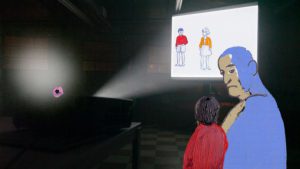
During the class trip to the 2017 Biennial at the Whitney Museum, I saw many fascinating works of art and film. One of the films that stood out to me the most was Tala Madani’s Sex Ed By God. I found this short piece really interesting. Tala Madani is an Iranian artist, who had multiple pieces of art at the Whitney Biennial, mostly focusing on genitalia. Sex Ed By God is a 2 minute animation which features a young looking female who is being projected on a screen while a pair of lips “God” ramble about sex, while two other men in the room look on, one older one seems to be a child. The pair of floating lips speaks in a heavy breathed voice and seems to be speaking about advice of stimulating a woman rather than typical sex ed classes.The men are staring at this woman on a screen, the words coming out of the lips are at times gibberish and not entirely clear

The part I like the best is how these two men and God are looking and talking about this female who is being projected on the screen, but then she reaches out of the screen and smooches the three of them in her hand and put them inside of her vagina. To me it is the moment when the woman takes control and power over the men who have been watching her this whole time. She then erases the screen she is on, taking herself off the screen and no longer an object to watch.


Sex Ed By God

Whitney Biennial 2017

Unfortunately, I wasn’t able to go to the Whitney Museum trip with the class last Friday because of allergies. However, I really wanted to go visit the Whitney Biennial, and just the Museum itself because I heard its a MUST GO place. A lot of my friends know and have been to the Whitney, but I’ve never been there before. So, I decided to go on my own this week and it was a great decision.

First off, the building itself is a work of art. It has all these different dimensions and huge windows that give sneak peeks of the wonderful works inside. Also, it’s a plus that I was able to go in for free with a Student ID. The Whitney Biennial was quite overwhelming. There were floors and floors of arts displayed. They were all unique and beautiful, but I’m not going to lie. I wasn’t a fan of everything.

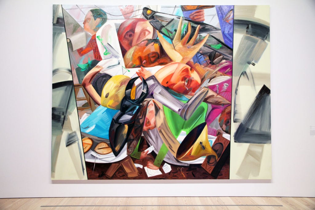
I love films and visuals with motion, but I’m also a huge sucker for paintings, sculptures, and photographs. Something about still framed arts make me think harder, feel deeper about them. One of the pieces I found capturing was a painting called Elevator. The painter is Dana Schutz. I really love this piece. It’s so detailed with different colors and textures. So many things are going on with so many different people, and yet, they’re all forced to be in this space to get to a specific destination. When I think about elevators, I feel like my time within that space is frozen. It’s a mindless ride. But for the time I’m on the elevator with the many people inside of it, too, I feel like, for that moment in time, everyone in it has the same goal, same feelings, same thoughts about whether the elevator will fall and our lives will end together, and just sharing a specific moment of being there together. Also, elevators are this closed space where anyone in it knows everything going on inside, while everyone outside has no clue. Playing with the use of privacy and being “revealed” to the public, almost like all of today’s hidden government issues, and even metaphorically like our hearts being closed and hidden of its chaos and brokenness. I feel like I’m babbling, but I’m sure I was going somewhere with this. Elevator is “that deep” for me. It just gets me thinking more and more. Just amazing!

As for film, I really enjoyed The Lesser Key of Solomon by Tommy Hartung. The reason why I really like this film was because of all the use stop-motion animations and just the overall color of the film. I read that Hartung created this film to capture this “hallucinatory reflecting themes of racial inequality, power struggles, systemic violence, and religious fervor”. Basically, it has A LOT going on in it. Although, I’m not a fan of dark demonic magic or anything the first part of the film talks about. I solely enjoyed this piece because of the aesthetically aspect of it. Stop-motion was a great touch to really give that distorted, breaky, unsettling feeling, which is something we feeling when we talk about “racial inequality, power struggles, systemic violence, and religious fervor”.

Whitney Biennial was very very interesting and I’ll definitely recommend more people to go before the exhibition ends! Maybe I’ll go again and maybe I’ll see new things I haven’t realized my first time there.

Whitney Biennial 2017

Whitney Museum Trip by Lucas Chang

Whitney Museum Trip

Overall, this was my second trip to the Whitney Museum since I went with one of my other classes last year. However, I one hundred percent feel that my second visit was way more interesting than my first time in the Museum. This was because my first time at the Museum, we weren’t allowed to separate from the group and explore different works of art all around the museum, which made the first trip less exciting for me. Since we were able to explore on our own this time around, I was able to see more exhibits and have a much better time.

One of the exhibits that I saw was a small room that had eight walls with baloney slices on them. Each slice had a face of a Jewish person in the center. Overall there are at least 2,755 Jewish faces on these 8 walls of baloney, which according to the New York Times and the Wall Street Journal is about twenty five percent of the total amount of Jewish citizens living in New York City to this very day. I found this interesting and fascinating because it was my first time that I saw a unique art exhibit was made based off facts about New York City. After I saw this exhibit, I had left feeling like I learned something new about the city that I grew up in.

Another exhibit that was enamored with was a small screening about a two Filipinos one men and one women leaning on each other in order to survive on an island. The man was seen saving the Filipino women by pulling her out of the water. The screening goes on to show the Filipino man describing some facts and information about the island to the Filipino women, to help her understand more about where she is. I felt that this screening was interesting because it showed how two people are trying everything they can to survive on a remote island away from civilization, with both of them only knowing so much about the island they are on.

One last exhibit that I found very interesting consisted of a small room with four walls that showed gates and fences on each wall which imitated the Mexican border. As you stay in the room, you hear train noises and cars and trucks driving by the Mexican borders through the gates and fences that are displayed on the wall. I felt this exhibit was interesting because I got to see what the Mexican border looks like for those who are trying to get into the United States or whoever is leaving the country.

In conclusion, my trip to the Whitney Museum was a much better experience than my first time at the museum since we were able to see different works of art and learn. I was able to have a much more enjoyable experience and even learned something new about my city that I never knew before. Overall I enjoyed my experience at the Whitney Museum.

Whitney Museum Trip by Lucas Chang

A Very Long Line

In our visit to the Whitney Biennial there was a piece I enjoyed because of the way it was shown. The piece was called A Very Long Line by Postcommodity which is a production team of Raven Chacon, Cristobal, and Kade L. Twist. The piece focuses on the border between the United States and Mexico which has been a big topic in our current political picture. The video was shown in a small room. There were four projectors each pointed at a different wall. It was filmed inside a moving car. All you see is grass and landscape behind bars and railing. The piece made me feel trapped behind all those bars but the sounds also were disorienting. It was so loud in there, all you hear is wind and breeze as the car travels along the rail. You also hear the passing of other cars as you would on a highway. Each projector showed a different video which was a different part of the border. The videos also played at different speeds so if you were looking at the video in front of you per say, it might be moving faster then the two videos to your left and right. This difference of speed affected your peripheral vision and made the video in front of you seem as if it were really moving. You actually for a quick second could feel transplaced into the area. The installation was designed to disorient which I thought it did really well. It also was designed to create a sort of amnesia feeling or condition to evoke this idea of forgetting ones origins. The origins being forgotten mostly by United States citizens the Indigenous status of people from the Western Hemisphere.

This piece got me thinking of the differences between a gallery installation and a piece that is shown in theater. It got me questioning if this piece would work and give the same feeling if it were shown in a theater and to answer my own question it wouldn’t. What makes the piece work in creating this atmosphere is that being surrounded by the four projectors displaying this video creates a disorienting feeling. If displayed only one screen I don’t think the piece would evoke the same feeling.

This is a link to the piece I found on youtube, you get a better sense of what I was describing but the effect is more moving in person.

https://youtu.be/yeXbIPmFTGE

A Very Long Line

Sex Ed by God

The class trip to The Whitney Museum was the first time I had ever been. I was excited to go because it is one of my friend’s favorite museums. He had already gone to see the biennial and told me many great things. As I explored the museum I saw several pieces that I thought were amazing. My favorite works were from the artist, Tala Madani. The piece I found to be extremely interesting was “Sex Ed by God.” The animated video featured floating lips narrating sex while two other characters watched. At the end of the video, a girl takes everything and puts it into her vagina. I enjoyed this piece because it forced you to use multiple senses to figure out what was happening. You’re required to wear headphones to listen to the piece, which I think results in more concentration from the person watching the piece. I definitely watched the piece more than once in order to make sure I wasn’t missing anything crucial from one of the characters. The other pieces I enjoyed by Madani featured babies. One piece was a painting of a baby reaching for floating breasts. The piece made me think about the way a baby see’s their mother’s breasts as separate from her. They are food not an extension of someone they adore. The other piece featured four babies crawling away with light shining from their butts. In the corner there is a man offering something to the babies as they walk away. I have no idea what this piece means but I thought it was very amusing. I would be interested in finding out Madani’s inspiration for the baby pieces. Another piece that struck me was by the artist Puppies Puppies. I almost walked passed it without realizing it was one of the art works. The piece was called Trigger and consisted of three gun triggers mounted on the wall. It was very minimal but conveyed the message that these small triggers are what is the cause of the damage a gun can do. I thoroughly enjoyed the trip to the Whitney and will definitely be back.

Sex Ed by God

Shabby but Thriving, A.K. Burns

Shabby but Thriving by A.K. Burns is a 36 minute video instillation at the New Museum. It features two projectors, two overlapping screens, and the viewing area is furnished with a stripped and gutted couch that has a blue under glow, and foldable stools. The intentionally dingy floor was also smattered with spilling bags of dirt, and white and neon yellow fishing lines extended from hand ornamentation on the walls. The two screens were set up in such a way that at times only one would be in use, sometimes there would be two different scenes playing at the same time, and other times the two screens were used in unison to create one whole image. Having one big screen and one smaller screen at an angle drew emphasis to important details and helped guide the focus of the viewer. The scenes were shot it in the New Museum’s 231 Bowery space, a prewar building adjacent to the Museum that houses the artist-in-residence studio.

The film had multiple subjects. In one portion it would switch back and forth between a semi naked white woman and a cross dressing black man taking out heaps of garbage through a basement and down a narrow stairwell. In another portion, there were children interacting with their environment in an empty off-white room, save for a couch. Both children dress in clothes that match the upholstery of the couch. One child is a girl wearing seashell pattern clothes that matches the couch as she plays with an aquarium. She grabs at the fish and sand in a way that is playful but childishly aggressive. It seems like she is trying to dominate this small ecosystem with what little power she has. The couch and the way she’s dressed contribute to a feeling of nostalgia, so that it almost feels like you are peering in on someone’s home movies from the 80’s. The other child featured in this project is a young boy with glasses wearing yellow plaid that runs around the room sometimes trying to swat at a fly. I was not able to tell if there was anything actually there, and the child himself also seemed confused and uncertain of what he was doing or why he was doing it. This contributed to theme of trying to exert control over surroundings even if it is to no end. Within the emptiness, the two children find things to give their day-to-day existence meaning, even if it harms things that are alive or imaginary.

Each subject interacts with his or her desolate and shabby environment in ways that are electric and dynamic. The blue under glow of the couch and the blue lights within the film made this otherwise nostalgic seeming piece become futuristic. The combination of found and constructed interiors blurs the line between what is real and what is imagined and felt. The description of the exhibit explains that the piece “ is organized around five elements: power (the sun), water, land, void, and body.” What really stuck out to me about this project was the way in which it drew attention to the ways we interact with our environment in both positive and negative ways. I am also drawn to work that explores issues of classism.


Shabby but Thriving, A.K. Burns

The Last of Us

        I chose to watch this film named “Akher Wahed Fina(The Last of Us),directed by Ala Eddine Slim in MOMA. This 95 mins film reveals the story of two men silently traverse a vast landscape, they get in the back of a smuggler’s truck. Sooner, they get attacked by men with guns and one of them escapes to sea, he sooner finds himself in an endless forest, where a kind of spiritual journey unfolds. What makes this film interesting to me at first was that it is dialogue-film, which to me is a rare thing to discover in films that are created nowadays. But that also puts the challenge in character’s facial expressions and the arrangement of the outline in order to keep the story cohesive to the audience. The protagonist’s facials expressions and the scenery shots got me interested the most in this film. I like the way how the director first uses close-ups on the protagonist to enlarge his emotions and then jump out to medium shots of his whole body and then long shots combining with the scenery and himself to show the loneliness of him trying to find a way out but somehow get surrounded by all the objects in the forest. There were some lines displayed after the gunmen trying to attack him and he was escaping to somewhere else, I remembered clearly there was one line that says “I vomited humankind, I surrounded myself along with natural and forest”. That was my favorite line in this film and I think that also highlighted the central idea which is to mark down the negative side of humankind and how it deeply affected and destroys the beautiful nature between each other. The man is a traveler, but the cruelty of humankind gave him disappointment so he then ends up with finding himself in the forest and looking for his own path. There was one scene when he fell into the big hole and underneath he found out the dead body of the baby bear and the sharp weapon that were used to kill the bear and he also got stabbed because he fell down and the weapon went through one of his knees. That made me think of the nature of humankind and how people create weapons that are fatal and use them against each other and nature species. The man also struggles with wolfs in the woods and that lights up one of the theme of this film : the struggle between man and nature and also the situation with contemporary migration. Towards the end I found one shot was very interesting to think of which is when the man was sitting by himself after seeing the death of old man who healed his wound. At night here came up with the bright light focusing upwards the man and as the man moves, the light moves as well. But the light doesn’t approach any closer, it was just in the further distance and lights up towards the man. The film leaves the open ending which the protagonist took of all his clothes and stands in front of the river and show his back to the audience. That makes me think whether he then jumps into the water and committed suicide or he wants to go up to the waterfall and discover the path or he gave up on his human nature and disappear in the woods.After all, I think this film evokes ourselves to think the humanity and struggles between humankind and nature.  

The Last of Us

The Unfinished Conversation

I experienced a fourty five minute three channel video installation by John Akomfrah called The Unfinised Conversation. The video focused on the life and work of a theorist named Stuart Hall. He was a cultural theorist. John Akomfrah used archival footage of international events and a set of Stuart Hall interviews and intwins them. It felt like mesh of two documentaries. It also focuses on Stuarts Hall concept of ‘becoming’.

The installation had three screens side by side. It was not used to complete one image, instead each screen had its own image or video. I found it most fascinating when a screen or two screens would go completely red to draw the viewers attention to one particular screen. Also the choice of red instead of just black. The red maybe was related to some of the difficulties and struggles Britain was facing and darkside of how some immigrants didn’t make it. Sometimes the side screens operated as if they were trying to help create the scenery of the environment. There would be nature or a cultural video of a city and its people. The video would have chuncks of Stuart Halls interviews but there wasn’t a consistant flow of when you heard his voice and you also saw him.

The video focused a lot on . The struggles of immigrants and feeling not apart of a culture although they are actively participating and learning about it. The issue of assimilation of immigrants is an important topic that many Americans think about weather or not they are immigrants. Stuart Hall speaks out and mentions no matter how much he studies or changes to assimilate he will never feel like a Britain citizen. The video would go from moments like these with Stuart voice and image to the archival footage of historical events taking place in around the world. The archival footage would have a different person narrating. It would shift back and forth. When the story would change there was a small moment of silence but it would start up very suddenly and end the same way. It felt like fragments of history and Stuart.


The Unfinished Conversation

Meshes of the Afternoon

Trance film is where a protagonist or a supporting character is in a dream like state, in other words imagine what is shown in the film to the audience. Watching the movie, a few things strike the eye first. From limb close-ups in the opening sequence to shadow illusions to the then-assumed fact that the protagonist is stuck in some sort of a time loop –only to find out that it’s just another illusion– to a distorted and decaying reality, to recurring items such as a key, a knife, and a record player, this movie portrays the idea of dream state in a unique way for its time. In this short analysis, I will try to explain these things from a personal perspective.

The movie starts with an arm extending through the sky, and dropping a flower on the ground. The protagonist reaches for the flower, grabs it, and through the reflection of her shadow on the wall, we see her smelling the flower as she walks towards a building. She climbs up the stairs, as reaches for her purse, pulls her key out. The key with the dramatic soundtrack banging with its every contact with the ground, falls down the stairs. She then grabs the key again, and enters the building. She acknowledges three items: a knife, a phone, and when she makes her way upstairs to the bathroom, a record player. She then scans the room, and falls asleep on the couch. Up until this point, a somewhat formula in shooting and narrative can be made: The shadow illusion as she walks towards her house; little-to-none portraits, merely her feet and items are clearly shown; a closing barrel like show to demonstrate the audience that the protagonist is in fact falling asleep. All checking the boxes of theory of causality and continuity. After this point, however, the things get a little bit Inception, so to speak. As the protagonist’s eyes close, she catches a glimpse of a woman in a dark robe walking towards the horizon on the road. In that instance, the camera moves back to the woman’s shadow, clearly chasing the woman in the robe. Within one more iteration, the protagonist finds herself in a time loop where she chases the woman in the robe, decides to enter the house and follow the same path of actions. But in each time, her former self, or a piece of her, is left in the bedroom. Also, this dreamlike state in which a time loop is active seems to decay with each iteration of itself. In second iteration, the protagonist catches a glimpse of the lady in the robe inside her bedroom, but as if she’s forcing things against the natural order, the climb up the stairs becomes a dreadful reality that’s physically warped to keep her away from her room. Right before the final act, the protagonist and her two former selves play a game. Each character belonging to different times grab a key in hopes of revealing who the lady in the robe is, and as the last iteration grabs the key, the itself is revealed to be a knife — which was in fact what they hoped to reveal with the game. She then grabs the knife, and moves to her sleeping self. As the last iteration of her dream state kills her, she wakes up to her husband asking her to sleep in her bed. In a series of events, she realizes, once again through the existence of “the knife” that she’s in fact in a dream that encapsulated her odd iterative dream state. As she breaks the mirror, it’s discovered by her husband, who casually walks into their house with the same kinda flower that got her into this mess, that she was in fact dead the whole time.

Personally, the fact that Maya Deren decided to use the score by Teiji Ito made the whole movie all the more meaningful. The way music kicks in during scenes is established early in the film, and it never changes throughout the film. In my opinion, this is particularly important, especially in a non-narrative silent film; the traditional movie follows a brief conclusion after the climax, but in this case, the previously established sound set gives the idea that there’s more to come (ie. second and third iterations). On another note, four step sequence where her third iteration has to fight her consciousness and travel through beach, grass, pavement, and rug surfaces is particularly an indicator as to human minds strengths on subconscious level. Overall, I’m not surprised that this movie was received the way it did. It has behavioral aspects that are both challenging and breathtaking, both of which are welcome. I wonder if Christopher Nolan had taken notes from this movie as his movie, Inception, clearly has some elements taken straight out of this film.
Meshes of the Afternoon

Le Triptyque de Noirmoutier

I visited the Blum & Poe art gallery to which is holding an exhibit on Agnes Varda. The name sounded familiar and I realized that I have seen some of her work in previous classes so I was very interested to see an actual exhibit on her. The gallery had a screening room of a short piece she did called Le Triptyque de Noirmoutier. The film was projected using three projectors and displayed on the wooden paneled door. The individual images were all still camera and comprised of a beach shot, a kitchen shot, and a cupboard shot. often times when one person (the main cast considered of an elderly woman, a middle aged man and women, and a young boy) would walk off screen from either a left or right direction they would end up in the other room or the beach itself (the beach instantly however)

The film is a 9 minute loop. I walked in what I assumed was the beginning but as it looped again for me I’m now thinking it could have been the end, the transition happens so fluidly it’s hard to tell. The spacing of the the room and placement of the viewing area puts the viewer in a position that their whole eyesight is filled with the film, almost giving it a sense of difficulty of which frame to focus on, not wanting to miss any detail or action in the other frames. This kept my eyes moving at all times, waiting in suspense for an action that sometimes would never come. The film depicts daily life at a beach side home, with the women doing house work while the man reads the paper and the child plays outside.  The noises would mix together from the three visual spaces, the sound of waves are accompanied by the peeling of potatoes and the clanking of cups in the other two spaces.

I was told that I was able to touch the board and pull the hinges closed if I wanted too, I didn’t since I was a it unsure but I like the idea that it was an interactive aspect of viewing the film, that the viewer can open and close the doors like the woman were opening and closing the cupboards, putting the viewer inside the space if they so desire. I think that may have been the goal for Varda, as she grew up in the same area with her family that this film was shot and that she wanted to bring the viewer in to be a part of her world, a part of a family..

Le Triptyque de Noirmoutier