Blue God part 1&2

I went to go see the films Blue God part 1 and 2 by Carl1 at Spectacle theater in Williamsburg. What first struck me was how little information there was about the film besides the trailer on the theater’s website.

The first film starts out with two school girls hanging out on a roof and talking with each other. There is atmospheric music but the dialogue is shown through text on monochrome frames like old silent movies, making it hard to know which character is talking. The lack of audible dialogue is a feature of both films, besides a scene in the second part. The two school girls talk about being tired of everyday life, finding it mundane and repetitive. They decide to run away and scenes of them walking through streets at nighttime follow until they eventually reach a beach where the first part ends on a long shot of the sky as it transitions from day to dusk.

The Second part is more abstract as it follows the school girls as they perform a ritual to summon the “Blue God” in a series of scenes. One scene features an older woman who cryptically speaks english set in a classroom where one of the school girls cuts the head off a chicken, the camera paying attention to the dripping blood. The second part of the film depicts the two school girls as they get infatuated with the indifferent and male, Blue God. There are many shots of the schools girls moving in unison. One of the school girls eventually performs a sex act with the Blue God, prompting the other girl to run to a cliff’s edge, the camera work and editing implying suicide.

After seeing the movie I was left confused about the meaning of the second part. The first was seemingly about the naivete of adolescence as the two girls seek to escape a modern world, that is in their opinion, too predictable and suffocating. After talking to my friend who I went to see the movie with the second part came to make more sense to me as he saw the films as an allegory for sexual maturity and growing up. The two girls act as representations of one person, the one who eventually commits suicide being the other’s innocence. This is apparent with the many shots of both girls moving in unison, essentially unifying them as representations of one person. The focus on the blood and the school room setting of the second part makes one think of the moment of having one’s first period. The death of innocence follows the girl’s first sexual experience, which essentially overshadows the naive and childish want for escapism that is presented in the first part.

After coming to this conclusion I came to appreciate the film a lot more, even though there is a lot of imagery and apparent symbolism that I didn’t pick up on. I was struck by the beautiful cinematography of the films; the first part features many tight shots of building walls that match the color of their surroundings and create interesting geometrical patterns in the layout of stones and tiles. The music used in the film is very atmospheric which made the whole project feel more like an art piece than a film. There are moments that dragged and felt like the creator was making them that way in order to have the film be more ‘artsty.’ Overall I enjoyed the film, I was really interested in the concept of making puberty into a surreal an metaphysical journey. As a moment that changes a person both physically and emotionally, puberty is in a way an event that feels jarring, awkward, and transformative.
Blue God part 1&2

Griffiti: Animation by George Griffin

When it comes to experimental cinema, I am particularly attracted to animation. Animation can be seen as the foundation on which cinema is based, and by it’s very nature allows for a reconstruction of cinema itself. If cinema or video reflects the world, animation exists outside of reality. There are no rules in animation, save for how well you can draw (or digitally sculpt), and how much patience you have.(The exception being stop-motion, which does require a connection to the world around you.) Much early animation involved playing around with moving drawings, creatively scratching the film stock, or discovering the magic of stop motion. It can be said then, that experimental animation is often about craft.
The program I attended at the Metrograph, Griffiti: Animation by George Griffin, reflects this focus on craft. The first short in the program, Rapid Transit, was done by arranging beans and other objects on a white, lit background in stop motion to create “kinetic, percussive” imagery in time with the background music. (The short was celebrating its 50th anniversary.) the second short, Trikfilm 3, alternated between a surreal hand-drawn animation and scenes of Griffin drawing the piece on a notepad in stop-motion. The stop-motion segments feature Griffin at a table drinking coffee when he decides to start the piece—creating art out of just a notepad and boredom.


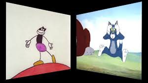
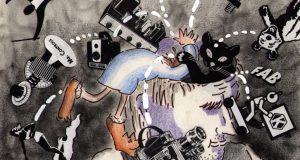
One of the more interesting pieces was Flying Fur. The piece was set to the background music from the Tom and Jerry cartoon, Puttin’ on the Dog. Knowing nothing about the source of the music, Griffin animated what he thought would be happening based on the score, only finding out where it was from later. (The piece was shown as Puttin’ on the Fur, in which both the original cartoon and Griffin’s piece were shown side by side. Similarly, Ko-Ko was an an animation using cutouts, animated in rhythm with music by Charlie Parker. The piece was intended to be part of a larger project involving Parker that was never completed.
Midway through the program, there was a documentary by Griffin and DeeDee Halleck, Meadows Green, featuring the Bread and Puppet Theater, a politically radical puppet theater. It was, not surprisingly, an outsider among the rest of the shorts. In a Q&A afterwards, DeeDee claimed that it was difficult to find distribution for the piece on American television. The short simply shows the theater’s antics at their annual Bread and Puppet Circus, occasionally broken up by Griffin’s animation. One of the first questions brought up by executives at PBS was why there wasn’t a narrator, which I found quite telling about the television industry back then: even PBS wanted to play it safe. One short piece near the end, The Bather, stood out to me. The film features a live-action shot of Griffin’s wife bathing behind the shower door, as a drawing of the woman plays in the foreground. In lieu of titles, a description of the short, including plot, genre, and themes, scrolls across the screen, eventually giving the audience some context that would not be otherwise apparent.


The best piece by far, however, was Lineage. A half-hour in length, and combining various types of stop-motion with hand-drawn animation, the piece deconstructs the nature of animation itself in, as Griffin’s Vimeo page puts it, “an anti-cartoon essay on animation’s contradictory legacy: comedy and formalism.” In one part of the short, The character Griffin creates interacts with the version of itself from the previously-drawn frame of animation, before stealing scissors and cutting itself free. This character, in stop-motion, is itself shown using a hand-cranked device to create an animation with moving lines. One section of the piece involves Griffin drawing on photocopied film stock, which moves in stop-motion as he colors it in. As this scene plays, he laments that the capture of images has gone from an art to a means of profit.
I found these pieces interesting and amusing, often in equal measure. All of them and more can be found at
https://vimeo.com/geogrif.

Griffiti: Animation by George Griffin

Andy Warhol’s exhibition at Whitney Museum of Modern Art

About three weeks ago I had a chance to visit Whitney Museum of America Art. The exhibition was dedicated to a very unique and in a way weird art of Andy Warhol. There were many different paintings, pictures, caricatures and abstract drawing on display at the museum. The whole Andy Warhol exhibition occupied three floors of the museum. The only things that I felt a genuine connection with were many different photos and color swapped pictures. Than one that I really liked was a picture of Marlon Brando in his leather jacket and a bike from the movie “The Wild One”. And to be completely honest, many film that were shown on the exhibition felt bizarre. I could not concentrate on one particular film because there were so many and all of them were strange.

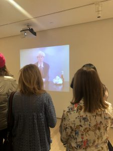
However, the one that strikes my memory the most is shown on a third floor and screen shows Andy Warhol eating a burger. As I stood there watching I was thinking about the thought process behind this film and I might be wrong but there was nothing special about that piece. People around me were fascinated with this piece but I kind of was not.  After that I watched some other short film which were shown on small old TVs with a dedicated headset for someone who would want to listen. These film were also very odd in a way. One showed a lady cleaning her room, the other showed two people staring and arguing with each other. I felt as if I was watching aliens on screen who try to replicate people’s behavior and interact with each other. Maybe that was the whole point after all to create a feeling of alienation to a  viewers or it might be that I did not understand something. It is hard to tell because one of my friends was definitely interested and very invested in all the art pieces. When I asked her to explain it to me, she could clearly deliver the message though.

At the end of the day,  the thing that I took away from this is that we live in a world which is too contemporary in a way that every media that we consume now is commercialized. Everything is picked out very carefully. If it is a car then it is the most luxurious car that you can find. If it is a model then it is the most stunning model on screen. If it is a sunset on a beach then it is the most breathtaking and colorful sunset. And then seeing something as simple and weird as a man sitting in a white room eating a burger, it simply does not spark the same interest and attention to it. The only thing that it does spark is a feeling of awkwardness.

Andy Warhol’s exhibition at Whitney Museum of Modern Art

“Programmed” At the Whitney

This weekend, I went to the Whitney museum in the Chelsea neighborhood and observed the exhibit Programmed: Rules, Codes, and Choreographies in Art, 1965-2018. The exhibit was a compilation of art created by all levels of programming that were at once introduced in the Whitney at one point of time. The exhibit deals with all types of experiments and productions that people worked with in art.

One of the most notable productions was a “choose your own adventure” laser that detailed the life of a women who spent a month without leaving her home because of Agoraphobia. I found it interesting, because I had no idea what was going on, but the idea was “gimmicky” or interesting enough to keep me pressing the different options and seeing how the adventure could end until I felt like I stayed at the piece too long. The piece is surrounded by a fake living room with a really comfy couch that lets you change the menus with a DVD remote, and I felt so comfortable watching everything, I felt uncomfortable sitting for too long when other people began to gather.

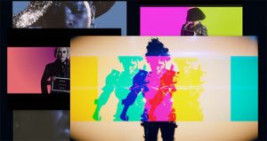
Another piece, which was the star attraction of the exhibit, was a giant multi-television media which was programed to use every monitor as part of the same piece. He video switched mainly between a video of David Bowie performing a dance with a woman, a blue faced computer-generated face, and a video of a naked lady walking with funky video effects. The piece gave me different feelings, as some of the things that the televisions showed worked in unison to create a piece, while other times, it felt random. I enjoyed it when the televisions flashed in union with a Bowie Song in a sort of pseudo music video only possible with the sit up of televisions. I initially did not care for the other seemingly random stuff, but after some time to effect I find myself looking fondly at the randomness and appreciative about the work someone made to program the televisions to do them, which isn’t normal for me.

The rest of the exhibit felt like the usual. Stuff that’s almost intriguing but is so far away that I didn’t really see the beauty of it. Although the aesthetics didn’t please me, I was always intrigued to learn how the artists were able to create their work, and in learning the goal of that artists and learning the steps and work they took to get there. When it comes to programming, a thing that is often unseen questioned, it was cool to see people ask their own questions and experiment with it in both the real and virtual worlds. In the end I felt like I gained more then ever thought I would.

“Programmed” At the Whitney

Metropolitan Museum of Art screening

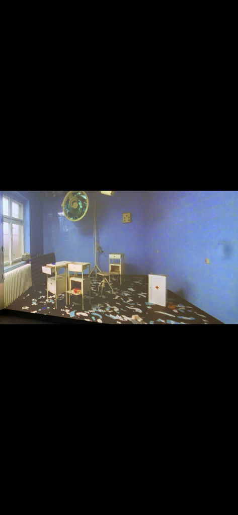
I went to the Metropolitan Museum of Art, on 86 street and 5th Avenue, where I was able to catch a short film, which is considered one of the best arts created to date. Stasi City (1997) is universally considered one of the most impactful works of video art of the last half century, because it was one of the first films to date that could be classified as an experimental film. the four-channel video installation is a dizzying tour of the former headquarters of the East German secret police (Staatssicherheit) housed behind a nondescript row of buildings in the former East Berlin.


When I walked in the room and saw the movie playing on four walls all in different scenes yet syncing up at the same time really threw me. As an outsider privy to this place even existing, the circumstances that these rooms were in really emphasized torture and struggle. Throughout the film, there’s a boy floating around, and I interpreted that as a spirit that lingered in this place trapped forever because this is where he lost his life.

Another very interesting trait about this piece is that it’s a silent film. For a silent film to be this suspenceful and this attention grabbing I’m sure was a rarity when this first released in ’97. The slowness of the footage evokes surveillance, the feeling of being watched, as does the installation’s layout, which draws the visitor into a corner.

Jane and Louise Wilson, the creators of Stasi City, were able to bring to life a very dark and overlooked moment in German history which I feel also make this piece very historic. The fact that this was one of the first film pieces to publicly expose some of the horrors that were going on in these rooms really magnified the dehumanization that went on behind closed doors.


I was a Journalism Major at one point before switching to Media Studies and this piece really reminded me of a Feature Article. Not your typical “soft news” Feature, but more like a story that a reporter had been working on for a while, digging up as much information as possible to them expose corruption almost like a breaking news story or something to that effect.


I really enjoyed the silent film and it made me think a lot on more of a journalistic side in terms of the approach and making is silent to add that much more suspense. Jane and Louise Wilson had real courage to make such a sensitive film public, but by doing so, they let the world know what was happening in Germany behind closed doors almost like a reporter breaking a story on a government corruption scandal here in the United States.

Metropolitan Museum of Art screening

Eduard Williams Shorts Program at Lincoln Center

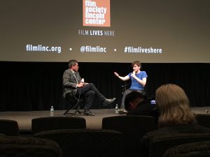
The event was consisted of four shorts directed by Argentina filmmaker Eduard “Teddy” Williams including Could See Puma, I forgot!,, and Persí. As I started watching the first and second piece, I found myself constantly looking for a narrative of the film by picking up visual clues such as locations, behaviors, and dialogues between characters. That’s where I got really frustrated since I could not get any idea of what I was watching. What’s the storyline here? What’s the meanings of this image and intentions of the filmmaker? The films rather became more ambiguous and poetic. I kept wondering and realized that his films focus on the ordinal moments in our lives documented in unique ways.

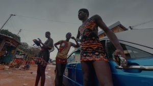
I saw lots of abrupt cuts, unique angles and replacements of cameras, and less explanations. All the films focus on young males and how they interact with each other. The shared theme among the three pieces seemed to be nature, plants, and fruits such as boys hanging out in abandoned buildings, cave, and around their houses. The locations of the shoots are different for each film including Argentina, France, and Vietnam. However, the director did not use conventional texts indicating time and location or personalize characters. It actually depersonalizes the image and characters. I started to realize there are more similarities than differences among people all over the world. Third piece was very interesting and experiments with the boundaries of repetitions where sounds get extremely overwhelmed. All of the sounds are juxtaposed two sentences starting “Seems like A is B” and last throughout the entire film. Moreover, image the filmmaker chosen to go along with the sentences are footage taken from 360 degree GoPro attached to roller skaters and men dressed as women cruising a town with their car. Again, no explanations to those characters at all and the image seem to be pretty much observational.
Fortunately, after the films, we had the filmmaker himself coming up to the stage for a discussion. This is usually a time for me to problem-solve because I can have better understanding of the meanings, intentions, and methods of the filmmaking explained by the filmmaker himself/herself. I bet many of the audience had a plenty of questions to ask as we are usually used to be given sufficient information about story and characters. I would say it was the most interesting discussion ever. What I basically understood from Teddy talking about his films was that he follows his intuitive artistic creativity and always experiments with how he shoots and shows the image. I didn’t quite get the answers to my questions! I headed to my home feeling like having an unsolved mystery in my mind. I kept thinking about what I saw until the next day, and I came to a realization that, that is what experimental filmmaking is. Shooting with a camcorder on a tripod does not always have to be the way to shoot. The filmmaker’s work is significant as he always challenges the normative of filmmaking and storytelling. I was inspired to explore, find, and sophisticate with my style.

Eduard Williams Shorts Program at Lincoln Center

Framework – The Filmmaker’s Coop

On February 20, 2019 I had the opportunity to attend a screen at the Ludlow House organized by the Filmmaker’s Coop. The screening was an accompaniment to the fall 2018 issue of Framework, a film and media journal highlighting artists pursuing new cultural and political perspectives in their art. Four experimental filmmakers, all of whom are in some way associated with the coop, had been asked by Framework to participate in their issue by creating a visual essay based off of their work. At the screening, each artist showed a portion of the work from which they drew to create their visual essay. The resulting screen was four very different artists, displaying four very different pieces of experimental film.

The first artist presented was Michelle Handleman. Michelle is a filmmaker who uses video and live performance in her work. The piece screened on this particular evening was a snippet from an installation currently on view at the San Francisco Museum of Modern Art called Hustlers & Empires. Hustlers & Empires is a three-channel video installation which intertwines the lives of three “hustlers” from various time periods. The piece included dialogue and musical numbers, all written by Michelle and her cast. The format she chose to show at the screening included video from inside the gallery, so we were able to see the actual installation, as well as clips from the video itself.

The second artist was Bette Gordon, showing the first 15 minutes of her feature film Variety, originally released in 1984. Variety is the story of a young woman living in New York City who takes a job selling tickets at an X-rated movie theater in Times Square after she is unable to find any other job. Desperate for employment, this sweet, innocent, Midwest transplant soon finds herself completely enthralled by the movies inside. I am not exactly sure what about this film qualifies it as “experimental,” but it was included in this screening of experimental works.

The third artist (and my personal favorite) was Rob Roth. Rob screened footage of a performance called Soundstage which was done in 2018. The performance included a live performance on-stage partnered with pre-recorded video footage. Rob, though he had not originally planned on actually being in the piece, performed live, while a pre-recorded actor, Rebecca Hall, was projected on screens around the stage. It was extremely impressive because Rob (on-stage) was interacting with Rebecca (in the pre-recorded video) as though they were acting with one another.

The final piece was by MM Serra. This piece, titled Enduring Ornament, was a found footage film made up of about 4 discarded 16mm peep show films from the 1940s which MM acquired after the closing of an adult bookstore in Times Square. She altered the film through optical printing and alternative processing. The result is often a very obscured image with amazing texture and movement.

I enjoyed this event very much. It was interesting to see some of the various ways artists are creating experimental work. Each piece was unique from all the others, so it was cool to see them back-to-back. This event really opened my eyes to the unlimited possibilities of experimental filmmaking.

Framework – The Filmmaker’s Coop

Andy Warhol Eating a Hamburger

John Romano

Andy Warhol Whitney Exhibit

Andy Warhol has created several films in his time. At the Whitney Museum this weekend I got to experience several of his experimental short films. I want to talk about one in particular because It was short but deep. I believe most of Andy’s films are about challenging the idea of what is art.

“Andy Warhol eating a hamburger” is a film that was shot in the 1980s by Jørgen Leth. Warhol decided to be a part of the film for several reasons. One of the reasons was that It was shot in his style. The film is a single shot film on a single camera much like a lot of  Warhol’s films. At one point Warhol struggles to pour the ketchup but the camera keeps rolling because that is the beauty in this particular film and art form. The idea that everything is art.

I saw this short film at the Whitney Museum in one of the main floors. The film is a little over four minutes long and shows Warhol eating a hamburger for the entire film. When you watch the film for the first time you may think its funny or you may feel uncomfortable. It’s fairly silent until the end when Warhol says his name and what he just did. It’s strange that we feel uncomfortable because he is performing an everyday action of eating something. However, silence is what makes It uncomfortable. He sometimes looks at the camera and other times looks shy and almost vulnerable while eating the burger.

The main point of the film in my opinion, however, is the idea of what is art? Pop art was formed because of the idea that every day things can be art. Art does not have to be unique so eating a hamburger could be art. The normal activities of everyday life can now be turned into art. Who is to question what is and isn’t art? Some people can see art in things that others can’t.

Warhol eating a burger from Burger King also shows that Americans are created equal. Warhol is an American born citizen who I believe took pride in being American. He wanted to show that celebrities eat the same food that regular American citizens eat. The film is digging deep into the American consumer culture. I think this is shown through the film because you expect something to happen during the film but the film just ends up being about a man eating a burger. The reason people watch this film even though it’s just a man eating a hamburger is because of Andy Warhol’s presence. People expect something greater because of a celebrity appearance. If It was shot with a man on the street people would walk away. However, people place celebrities on a pedestal and look up to celebrities even when they do everyday mundane things. The way Warhol moves in the film also shows his character and personality as an artist. He knows how to move an audience in a very simple way.

Andy Warhol Eating a Hamburger

Anthology Film Archive: “Not a Pretty Picture” by Martha Coolidge

“Not A Pretty Picture” by Martha Coolidge is film that was shoot in the 1970s. The screening of the film took place in the Anthology Film Archive located in down town Manhattan. The story was about a rape that happened to Coolidge back when she was residing at her school. She filmed it in away that had the actors speaking about their point of view or at least the things that they must think about just to get into character. It was a good inside look as to how actors prepare themselves and it also shows that the director can rely on some form of improvisation if it fits their vision.

Martha Coolidge can captivate the pressures that a teenage girl had to face in the 70s if she was the victim of rape. Unfortunately, the 70s still had a lot of conservative influences to the extent that a woman’s right was still very limited. Subjects such as abortions were very taboo, and girl was viewed as easy or dirty if she would have more than one partner. The film also managed to show what the mentality of some men at the time had when it came to consent. One of the actors, who was playing as the rapist, stated that sometimes a guy can misinterpret a “no” as a form of playing hard to get. However, a no regardless of how it sounds should still be taken as a no. The actress playing as a young Martha also had a rape experience of her own. She stated that she didn’t want it, but it seemed as if the man who raped her didn’t fully understand what he was doing or even understood that Martha was not consenting.

Artistically the film was shot years ago so I wasn’t expecting HD quality, but it was still shot well. Since the film was dialog heavy most of the shots were profiles or up-close shots. Coolidge also used a lot of single shots since the actors would improvise from time to time. She truly relied on them to interpret the emotions and mentality of both the rapist and the victim. The supporting actors were also important for the film since they are the ones who set-up the scene and the personality of the main cast. We notice that through the banter of the supporting cast that rapist is already a douche. He treats others like lower class citizens and even makes fun of one of his friends because he got into college. During the scene in which they are in school he ignores Martha after she tells him that she is possibly pregnant.

Through Martha Coolidge’s film the harsh reality of a young teenage girl’s life during the 70s was very difficult since society was more conservative than today, so the idea of a young girl aborting was almost blasphemy.

Anthology Film Archive: “Not a Pretty Picture” by Martha Coolidge

Lygia Pape: A Multitude of Forms

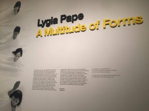
For my last blog assignment, I went to the Met Breuer to visit the Lygia Pape Exhibition. I was absolutely in love. I have never heard of Lygia Pape before I went to the exhibition and had no idea what kind of artist she was. From the moment I walked in, every piece of art resonates in my heart. The reason why I love her work is because I am a huuuuuuge minimalist. I;m not saying her work is totally minimalistic, but it definitely had that kind of impact on me. Each piece was so simple, yet intricate at the same time.
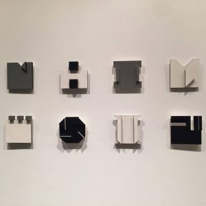
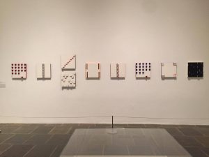
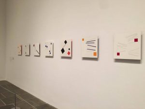
There were a series of favorite pieces of art at the exhibition. Not to mention, her color palette was beautiful. I loved the yellow, black, and gray, as well as pops of red, green, and blue, and a base of white. Some of my favorites would have to be….

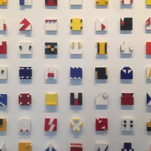
There was a wall filled with colorful patterns (the one shown all the way at the right above). I’m not sure what this wall signifies, but to me, it felt like different patterns fitting well when put together. Almost as if it’s talking about different people, cultures, languages, can all come together, unified. The colors were popping right off the white wall, literally, because these patterns are 3D. If she was alive… I would want to work under her and learn to be as creative as she is.

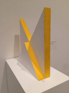
Another one of my absolute favorites was this piece. (picture shown below). It’s white and yellow and stunning. It kind of reminds me of mountains, but honestly, it’s just one of those pieces I adore without much analysis. It’s aesthetically pleasing and I would love to take it home. I forgot what it was called, but nevertheless, I loved it.

A experimental film that I enjoyed was called Ballet neoconcreto I (Neoconcreto Ballet I) 1958. According to the little information plate they show next to the film, the film is based on a Concrete poem by Reynaldo Jardim. In the peom, Jardim states eye and target, which I’m still not sure what it really means. Pape’s rendition used blocks to represent “eye” and “target”. The blocks were a combination of cylinders and rectangles. They would move within the film, creating this ballet(?) In the information plate, it states, “Pape replaced the simulated movements and imaginary settings of traditional theater with the concrete drama of basic forms shifting in space and times”. Such a simple film with such depth and meaningful purpose.

The Lygia Pape exhibition has definitely opened my eyes and inspired me to continue to create minimal work. I absolutely loved everything she created and I think Pape is a renowned artist to have her own stylistic choices and patterns. I believe that her work of art will continue to inspire many other artists out there.

If you haven’t gone to this exhibition, I would highly recommend to go before it closes because  I’m sure you won’t regret it. I’d probably go again.

Lygia Pape: A Multitude of Forms