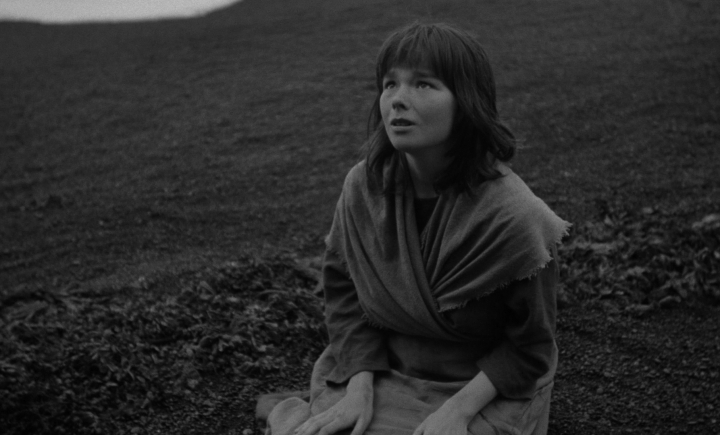
The Juniper Tree

A couple of weeks ago I went to Metrograph for the first time to see The Juniper Tree an experimental film written and directed by Nietzchka Keene. What interested me initially about the film is that is stars a twenty year old Bjork and was shot in Iceland. The movie is based on the fairy tale written by the Brothers Grimm, which also was a factor in my decision to go watch it.
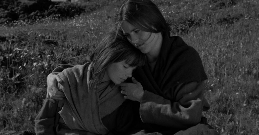
The film begins with two sister traveling away from their hometown after their mother was brutally killed by stoning and then set on fire due to accusations of being a witch. The older sister, Katla tells the younger sister Margit (Bjork) that she will find a husband and cast a spell on him to love her and support the two of them. When they come across a man named Johann whose wife had passed Katla does exactly that. What she didn’t expect was his young son Jonas to see through her rouse. The young boy sees Katla casting a spell and sewing her footprint into his father’s coat. He is cold towards her and suspicious of her actions, driving a wedge between her and his father.
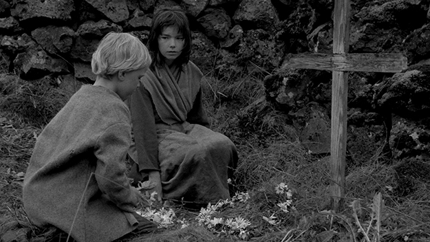
Margit and Jonas begin to connect and he shows her his mother’s grave. They put flowers on it and Margit finds a ravens feather. She enchants the feather and ties a string around it to make a necklace for Jonas, stating that his mother transformed into the raven and left the feather as a means to protect him. While by the waters edge with her sister, Margit has a vision of her mother. Unable to see into the spiritual world Katla begs Margit to explain what she sees, but she is unable to put it into words.
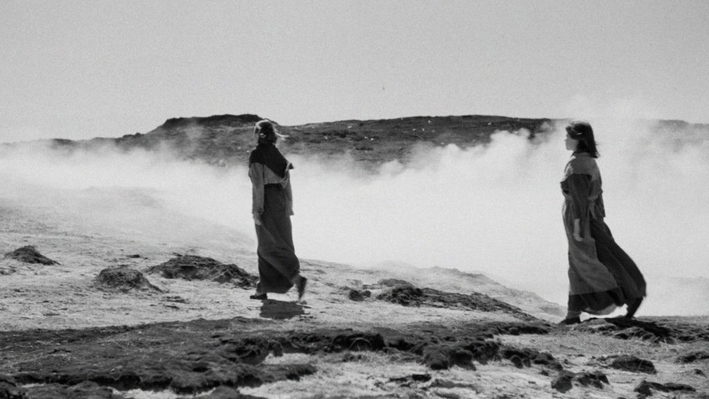
These visions happen more and more often, driving Margit to venture out into the wilderness at night, following her mother’s ghost to the edge of cliffs, under waterfalls, and through the woods. At dawn her mother calls to her and she wakes Jonas to join her outside. They sit in front of her mother, and the mother reveals a hole in her chest. Margit reaches her hand through the whole and the screen is filled with a flock a birds covering a clear sky. Coming out of the vision, Jonas is asleep beside her. When she wakes him he states that no one was there in the field with them, that he did not see what she saw. Later, Jonas becomes more and more suspicious of Katla and tells his father she is a witch. Johann wants to leave her but her magic is far too strong for him to break free.
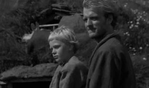
Jonas becomes indifferent and runs away. Katla finds him and argues with him on the edge of a cliff but Jonas yells at her stating that her magic cannot harm him. He wields the feather that was from his mother and states that she is protecting him. She tricks him by saying if his mother is really protecting him that he should jump and see if he lives. Of course the young boy plummets to his death. Katla thinks that her problems are over, she sews the dead boys mouth shut, cuts off his finger and keeps it, then sends his body a float down the river. That night she cooks a stew and puts the boys finger in it, casting a spell that will cause Johann to forget about his son. As they eat, Margit finds the finger in her soup and internally freaks out, knowing what her sister has done. After dinner she buries the finger at the site of Jonas mothers grave.
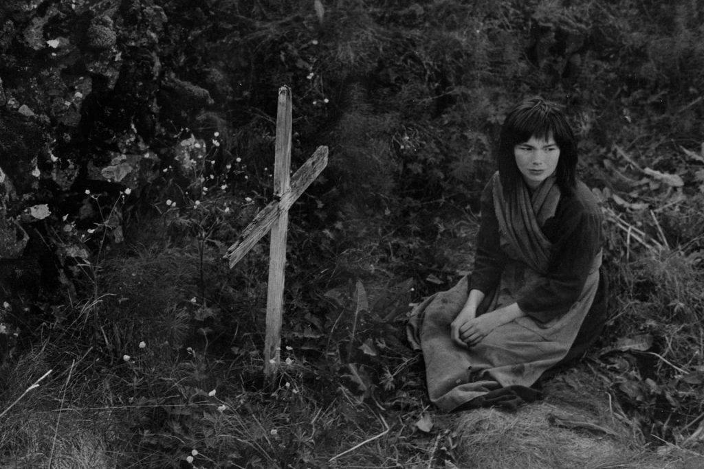
The very next day a large juniper tree has grown at the grave, and the raven has taken up residence in it. Margit rushes back to the house and confessed that her sister has killed the boy, but she did not mean to. Her sister flees the farm in fear of her life, leaving Johann and Margit alone together. They live on and continue to care to the tree and the raven.
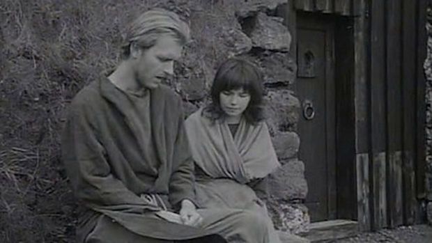
Many aspect of this film intrigue me and leave me grasping for meaning. First of all, I really enjoy the juxtaposition of Johann and Jonas Christianity and Katla and Margits Pagan practice. Another idea that comes to mind is the assumed naivety and innocence of woman, how seemingly the devil and woman do not go hand in hand, the age old conflict between ancient constructs and modern femininity. That’s why I appreciate Katla character, she is evidently evil which goes against the “ideal form” women “should” encompass. Keene breaks from these traditional ideals of women, and creates this dark female lead character.
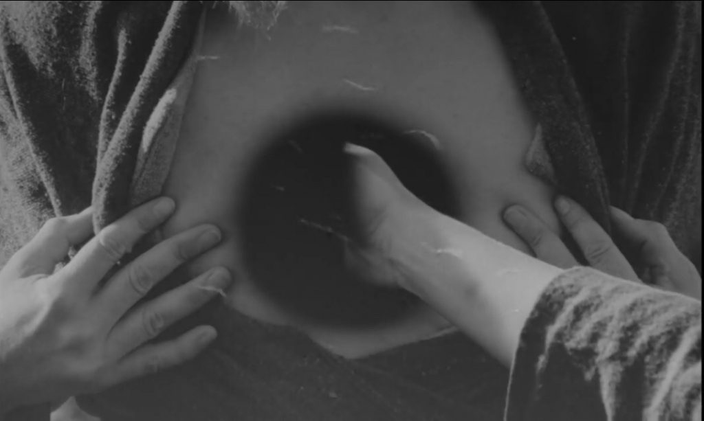
I appreciate the use of birds in this film as well. To me they symbolize the idea of freedom and change. When Margit explains that the raven is Jonas mother, it made me think that this is a necessary change in the boys life. He needed this to push himself to confront Katla and try to save his father from her suductive grip. When Margit touches the hole in her mothers chest she is transported into a flock of erratic birds flying in the sky. I understood this as her want to be free of the gift of sight, of the life that she is forced to live. Margit want freedom from her sister, from her life, to live as a normal child instead of being caught in confusing magical world that tortures her with visions of her deceased mother. Watching this film once was not enough to gain a true understanding and I want to see it again in the future.

The Juniper Tree

New Order: Art and Technology in the Twenty-First Century

Don’t just live your life—drink it.

In an era where technology seems to permeate every aspect of our lives, with often terrifying consequences, it seems like we are powerless to control the digital behemoth we have created as if it were some kind of algorithm-powered Frankenstein monster. MoMA’s exhibit New Order: Art and Technology in the Digital Age demonstrates this relationship between the real and digital worlds in ways that I found creative, amusing, and often terrifying. Using a variety of methods including self-run computer animation, sculpture, video, photography, and even film, the art and their artists paint a vivid picture of our current world.
Among my favorite pieces was Skittles by Josh Kline. At first glance, it resembles a simple beverage refrigerator like you’d find at a convenience store—perhaps MoMA added concessions before the exhibit. Look closer, though, and things become less appetizing. Smoothies with questionable—and often inedible—ingredients line the shelves, with each flavor offering a different lifestyle. For example, the Williamsburg flavor is made with bits of credit cards, American Apparel, kale chips, kombucha, microbrew, quinoa, and agave. Yummy. It’s pretty obvious this isn’t real, but if you’re the kind of person who consumes kale chips, kombucha, quinoa, microbrew, and agave while wearing American Apparel, you embody what people imagine when they think of someone who lives in Williamsburg. What you consume is what you are—and here it is, bottled en masse for your convenience.
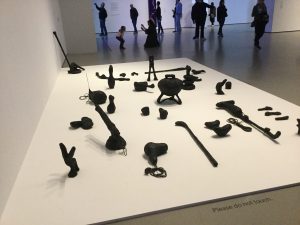
While I’m on the subject of consumerism, Augmented Objects by Camille Henroit features objects bought on eBay and from street vendors, coated in epoxy, tar, and sand. The results look somewhat similar to their original counterparts and are now unusable. As a result, “Henroit thwarts the normal flow of objects, commodities, and digital networks of exchange.” The black blobs on display look burnt, as if a volcano had just erupted. It’s a chilling metaphor for the futility of our current materialistic lives.
Some of the artists had decidedly less fun with their pieces, including Trevor Paglen with his piece, It Began as a Military Experiment. It presents a series of faces, their features marked with letters around the edges. The images were used by the Department of Defense to compare faces, creating a database of facial recognition that could be used to develop an algorithm that could identify people—which today is on a much larger scale and no longer just part of a private domain. Other pieces were utterly fascinating from a technical level, such as a number of holographic images that I found astounding (though initially a bit hard on the eyes).

Never have a garage sale near a tar pit.

The piece I was intrigued by, as well as unsettled by, the most was Xenix by Taylor Robak. Presented on seven screens, the piece depicts what appears to be multiple iterations of an operating system. Graphics depict such trivial tasks as storing food in a refrigerator, scheduling TV shows, chatting, and playing music in the background. One some of the screens though, are guns and a bomb that are initially created in real-time using 3D software. A map often shown in the center of the screen implies sinister military purposes…yet nothing really happens. There are none of the consequences we’d expect from such a setup. At the same time, it shows how much of our lives is carried out on our smartphones and desktops, and perhaps darker things in the future.
In general, I really enjoyed this exhibit, and I liked the ways various artists addressed the roles technology plays in our lives in ways that are unorthodox and ambiguous, but unsettling nonetheless.

New Order: Art and Technology in the Twenty-First Century

Mark Leckey Made in ‘Eaven

Mark Leckey Made in ‘Eaven
Mark Leckey is a British contemporary artist, working with collage art, music and video. His found object art and video pieces, which incorporate themes of nostalgia and anxiety, and draw on elements of pop culture, span several videos. This week I visited the MOMA with the class and experienced his work.

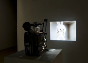
Projected onto the wall was his piece Made in ‘Eaven. The piece revolves around an image of a stainless-steel bunny by artist Jeff Koons, which is apparently, one of the most coveted objects on the art market. The bunny sits on a pedestal in the center of an empty room which I didn’t know but is Leckey’s studio at 7 Windmill Street, London. As the piece plays we are brought in and out from the bunny with a series of pans and zooms. However, what I started to realize was that there was no camera present in the reflection. The video also seemed very smooth and unnatural almost like the movement was fake. That’s when I found out that the video is half fake.

Mark Leckey uses technology to his advantage in this piece. The bunny is not actually in his studio. I believe that he combines real footage and digital tools to create this piece. He essentially makes It feel like the bunny is actually present in his studio. The image is a digital fabrication transferred to 16mm film. The reason we do not see the camera in the reflection is because the bunny is digital. He reflects the areas of his room onto the bunny which makes It seem very realistic. He makes the viewers believe that all of the film is real and none of It is digital. It almost feels like magic.

I think that what he did for this film is great. The new world is all about technology and how it’s ever expanding. Combining real imagery with digital imagery is experimental in so many ways. He brought this art piece that a lot of people are familiar with into his home without actually bringing It into his home. He did It so well that It’s super convincing, so convincing in fact that he probably tried to convince himself that It was really there. Incorporating real imagery and digital imagery is the way of the future. A lot of people do It, especially in movies. I think he really nailed this piece by choosing to combine the digital world with the real world. If the camera was present in the reflection all of the magic present in this film would be gone for me. If It was possible for him to get the bunny in his studio, he could have filmed It and got rid of the camera digitally. However, I know that wasn’t possible so this takes It to the next level. I found this piece very interesting and encaptivating regardless of It being a single shot film of a bunny in someone’s studio. It’s the magic that is present in the film that really drew me in. As I read more about the piece I began to love It even more.

Mark Leckey Made in ‘Eaven

Karrabing Film Collective


On Saturday, April 27, 2019, I attended an exhibition of the Karrabing Film Collective’s work which is currently on display at MoMA PS1. The Karrabing Film Collective is a group of indigenous artists, filmmakers, and activists living in the Northern Territories of Australia. According to the museum’s program, the collective makes use of its films and installation art as a “form of grassroots resistance and self-organization.” This exhibition is the first time that the collective’s work has been displayed in its entirety within the United States.

The Karrabing Film Collective consists of around 30 members of all ages, from children to elderly people. Since having been established in 2011, the collective has produced an impressive body of work which consists of nine short films, both single and multi-channel, as well as accompanying sculptural installations. Each of the films and sculptures set their aim on addressing issues facing indigenous people in Australia. Their films, which are semi-scripted, incorporate elements of both documentary and fiction filmmaking. Though dramatized, and often satirized, the collective’s films are informed by their lived experiences within settler colonialism.

One of the films, which I was able to see in its entirety, was the single-channel film When the Dogs Talked (2014). The film was projected on a wall inside a small gallery room. In the center of the room were five chemical waste containers. The containers, which were one of the sculptural elements included by the collective, also functioned as seating for the film. This is a significant symbol, being that the indigenous people were expelled from their lands and have been forced into areas which are in dangerously close proximity to chemical waste areas.

The film, which was divided into chapters, was one of their more narrative works. The film centers around a large group of indigenous people living in a house in the country. The film opens as the camera pans through the home. There are sleeping bodies covering every inch of the frame. As the rest of the house sleeps, one of the adult women quietly sneaks away and is seen walking out into the country. The rest of the house is awoken by a knock on the door, a department of housing has come to evict the group if they are unable to speak to the homeowner. It then becomes clear that the woman they need to speak to is the same one who had left the home in the early morning and now the group has no way to contact her. The rest of the film follows the group as they travel out into the wild Australian countryside in search of the woman. While they are on this search, the elder members relay traditional stories to the younger members of the group. This film, like a majority of the groups work, addresses the relationship between the indigenous people, the land, and the interference of colonial institutions.

Karrabing Film Collective

Daisies (1966 Film)

Dasies is a 1966 Czechoslovak comedy-drama film written and directed by Věra Chytilová. Generally regarded as a milestone of the Nová Vlna movement. It follows two teenage girls (played by Jitka Cerhová and Ivana Karbanová), both named Marie, who engage in strange pranks.

I know the assignment was to go watch it at like a museum or a screening event but, we had a brief conversation about this film as a class and it sounded really interesting so I decided to watch it on Youtube.

according to wikipedia.com, “novatively filmed, and released two years before the Prague Spring, the film was labeled as “depicting the wanton” by the Czech authorities and banned. Director Chytilová was forbidden to work in her homeland until 1975.” This film is huge for the women empowerment movement in that it’s one of the first international films to be written, directed, and starred by women, which was unheard of at the time.

Throughout the film, the girls go on dates with various older men. In each scene, the girls cavort and eat lots of food while mocking their date, who is driven to the end of his patience, at which point the girls say that they are late for a train, and then ditch the man at the train station.


What resonated with me from the early stages of the film is the strong sibling dynamic these two girls have, very playful very in sync which gives it the real feel. When they go out to eat and the girl in the white dress eats like she never ate before is hilarious because she seems so out of place.


Throughout the film I get the vibe of a satire show on a late night, mostly because of the ridiculous scenes that appear along the film. the girls eventually go to a nightclub and cause a mini brawl. Marie II also goes to the apartment of a man who is a butterfly collector. In this scene, there are a lot of butterflies shown as still frames. The man repeatedly declares his love to Marie II, whom he calls Julie. At the end, she says that she wants to eat. In later scenes, the two girls lounge about in various rooms while listening to their suitors profess love for them over the phone.


While there is certainly an air of whimsy to this film, it is also made with serious themes – relative to both its origins, and to a much more far-reaching time and place. Daisies, and its creator, are major proponents of feminism; agendas clearly stated from the onset of the film. The Maries are frustrated with the labels imposed on them, being young attractive females. Remarking that society see them as “dolls,” they are forced to abide by these societal guidelines. They should not become scientists, they cannot be artists, they would never make it on their own; they must have fun while dating around, and quickly find a husband.

Constantly accosted with the knowledge that beauty and youth are fleeting , they are only told to have fun while they can, never to better themselves to ensure a brighter future. Any outburst from the duo is quickly recognized as improper: women are to speak gently and be polite, it is men who have large appetites and can speak brashly.


Daisies (1966 Film)

Chiron by Adelita Husni-Bey at New Museum

I saw an exhibition called Chiron by an Italian artist Adelita Husni-Bey at New Museum on April 25th. The origin of the title comes from the Greek mythological figure Chiron which evokes the notion of the wounded healer. She addresses themes such as migration and displacement. The exhibition is located at the very end of South Galleries on the first floor separated from other work by a hallway and doubled black curtains. It created an interesting feeling in myself, feeling of not knowing what’s on the other side and of finding out what’s behind the curtains. Among the three short films exhibited, I liked the one that touches on immigration reform in the United States.

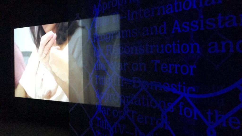
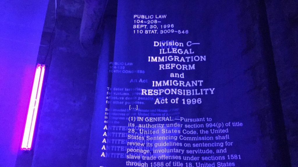
The film starts with a group of young women and men, who address themselves as lawyers, discussing laws whether they are tools of the law or the law is a tool for them. The footage includes close-ups of their hands and faces and uses techniques of pulling focus and taking one shots. Its soft focus and how it adjust the focus on the subjects create a feeling the camera is floating around the room not in an intimidating or surveilling way. Gaze of the lawyers is shared among them and does not directly address the existence of the camera. Two long shots reveal that the lawyers are in a typical-looking conference room and in an office. I thought heavily relying on the close-ups and using blue lights were very productive and creative ways of shooting the space since the conference room and office has almost nothing that’s visually pleasing to look at. What’s interesting is the subjects themselves and what they are talking about. B-rolls include observational footage of the abandoned houses, the lawyers pretending like they are typing something on a computer whose screen is turned off, and experimental/performative exercise. The computer footage, I think, is a symbol of them resisting to the system but not getting any feedback as they mention how the system(the law) in the United States does not support immigration and undocumented people and they face frustration of not being able to use the law to help and protect those people. Even though I know a little about theatrical exercise and technique which cultivate body-to-body relationships and break the physical and mental barriers among people, I was not quite sure what the participants are engaging themselves into for what purpose.

In a book called the World of Creativity(Sozo no Sekai), a Japanese writer Ayako Sono talks about how artists don’t have to explain anything further than the work itself as it should tell just sufficient amount of information the audience needs. I have learned that in visual/experimental  production, we don’t necessarily explain everything. However, reading the exhibit’s explanation really contextualized what I just watched. I learned that the film features members of an non-profit organization UnLocal that provides free legal representation to undocumented immigrants in New York City. Husni-Bey conducted a series of workshops there throughout last fall to address oppression, emotional depletion, and the psychological consequences of immigration enforcement. The participants of Husni-Bey’s workshop use theater and creative writing as means to de-individualize pain and to understand its political ramification.   

If I didn’t see the explanation board which I red after watching the piece, how much story and information I could get out from the artifice itself? The film is truly significant and experimental as it does not employ a conventional interview style, but it is still crucial to consider what details a filmmaker includes and omits in her/his work to effectively tell a story while maintaining aesthetic visual presentations.

Chiron by Adelita Husni-Bey at New Museum

Enthusiasm or Symphony of the Donbass

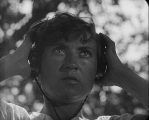
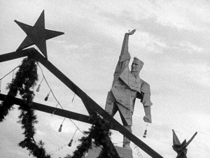
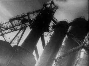
I went to see Enthusiasm or Symphony of the Donbass an experimental film by Dziga Vertov. I saw this screening at the Anthology Film Archive downtown, it was my first time attending a screening there and it was a great experience. The film begins with a young woman sitting outside at a table. She puts on headphones and then starts adjusting dials on a radio. It then cuts to shots of people praying in a village square. Vertov shows many different people kneeling and bowing their heads at the feet of a statue of Christ, after they finish their prayers they are shown kissing both of the icons feet. These clips are intercut with shots of Russian architecture, crosses, more statues of Christ, as well as alcoholics drinking and passed out in the square. I took this as a statement about loss of innocence. Following these shots are clips of groups of people parading through the streets and tearing down a church. They start to disassemble the church, taking out all of the religious paraphernalia and ripping down the crosses on the top of the steeples. The rest of the film shows different coal factories and factory workers doing endless amounts of labor, and then farm workers also working the fields. The reason this film is considered experimental is because it is the first film that Vertov created with sound. It is considered a symphony because the sounds of the rallies, workers, chants, and that of the coal factories and machine sounds create this almost rhythmic musical essence. What I noticed is that the sounds do not sync up with what is being displayed visually. This was somewhat jarring at first but then became hypnotizing. To me it seemed that the audio could be considered a character of the film on its own. This  I believe was Vertov’s intention.

After reading a description of the intention of the film I realized that some of my assumptions were correct. Vertov intentionally did not sync the score of the film with the visual video aspect. What I found out was that the film was created to promote and celebrate Stalin’s Five Year Plan, and the Donbass region was a sort of epicenter of the plan. Due to the large amount of coal in the region it contained a lot of this natural resource. The Five Year Plan helped this region attain its full form of industrialization. During the film,  there is an announcement made which states that the Five-Year Plan was completed in four years, which I did not catch while watching the film due to the fact that I do not speak Russian. This was possible because of the efforts of the workers, with their enthusiasm and dedication. Despite their completion of the Plan, they continue working, and the cycle never ends. Ending the film with showing the farm and field workers is a way of juxtaposing the old way of life to the new industrialized way of life that socialism formed. This specifically shows how the old way has been formally superseded by the industrialized and socialist world. In very thought out way, Vertov juxtaposed images of the role of religion and the field workers of the past with images of industry, production, and mechanization.

Enthusiasm or Symphony of the Donbass

Andy Warhol at the Whitney Museum

Towards the end of last week I was able to visit the Whitney Museum of American Art. The Whitney has been showcasing Andy Warhol’s art throughout the museum since the start of November 2018, through March 31, 2019. I have visited the Whitney in the beginning of December and haven’t visited since. They added a miniature screening theater to showcase his short experimental work. The Whitney had already used an entire floor to show most of his videos on TVs and projectors, this addition was held in the middle of other works of art besides just video.

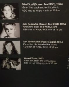
I sat down to watch two different pieces with the same concept behind them I would say. Both pieces were about eight and a half minutes long and both of these videos were screen tests. Andy Warhol encouraged the subjects to follow strict rules, like to sit as still as possible without blinking, for the whole roll which was a little over three minutes. I only learned that Warhol wanted his subjects to do this after my viewing, this fact did make the pieces make a little more sense. The subjects that I sat and watched were Ethel Scull and Edie Sedwick. Ethel Scull was first on the screen and she was sat directly in front of the camera, set up for a close up shot, for the length of the roll film in the camera. At first she was opening her eyes wide and stayed sitting in the chair. After a minute or so when she began to blink she gave in a little bit and did not sit up as straight as she did in the beginning. She began to try again to keep her eyes open as long as she could, but the roll of film seemed to be longer than she expected.

At the end of each of these pieces you can tell the whole roll of film is used up because of the flare effect that happens when the roll is used up. This happens at the end of Ethell Scull’s and Edie Sedwick’s film. Edie Sedwick was trying her hardest to keep a straight face without blinking when it was her turn in front of the camera. Even though she might’ve lasted a little bit longer than Ethell Scull, after she blinked and smiled she wouldn’t try after that. She would continue to blink, but still try and stay still for the camera like Warhol wanted them to behave. She was different from the first woman Ethell Scull because she wasn’t trying to stay serious the whole time. Even though she blinked and was beginning to laugh in front of the camera, she still tried to stay still.

These short screen tests for both women interested me because it made me think why would Andy Warhol want to make films like these. It made me wonder if Warhol wanted to show how human these two women are and just like any of us they can’t stay still. He could also be demonstrating how difficult it is for people in general to keep still and people just want to keep moving. These two pieces were short, but had a lot to say in the short time that they had.


Andy Warhol at the Whitney Museum

Jim Henson’s Time Piece

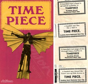
Time Piece is a 9 minute experimental film by Jim Henson released in 1965. It was directed, written, and produced by Jim Henson, who also stars. I watched the film at the Jim Henson exhibit in the Museum of the Moving Image in Astoria, Queens. The piece was shown on a small screen alongside Henson’s other experimental and mainstream work. This was one of the few pieces that was live-action, in that it didn’t involve puppetry. Most people know Jim Henson for his work on The Muppets and Sesame Street, which are positioned as cultural icons in the American media canon since the 1960s through modern times. I was pleasantly surprised to find out that Henson’s creativity has been used in a more experimental way while still remaining playful, provocative, and entertaining.
 

The man goes to work, goes on dates, and lives his relatively mundane life until he is imprisoned for shooting the Mona Lisa, and escapes wearing different disguises until he is shot down by military force.s The film’s end reveals that Henson was experiencing his life condensed in the last moments before his death. The camera moves from the lifeless body to the doctor, who is revealed to be Henson, and he winks at the camera.

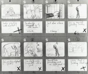
The piece begins with Henson at a doctors office in a hospital gown receiving what looks like a routine check up. However, the doctor comes into a problem when he cant find his heartbeat. The film then goes through a series of seemingly unrelated short shots cut together rhythmically, with brief interludes of brightly colored construction paper animation. (The film was actually not written, but each shot was fully storyboarded, which comes across in the visually striking and graphic framing, usually created to make a graphic match).

Each shot lasts only a few seconds, creating a dizzying viewing experience. The soundtrack by Don Sebesky roots the film in a consistent pulse. This is also aided by a lack of dialogue save for Henson’s few utterances of “help”. The film, although distinct from most of Henson’s other work, still very much feels like a Jim Henson project. The acting and direction feels disorienting and bizarre but humorous and relatively accessible. The film uses some visual metaphor (like the repeated shot of painting an elephant pink to represent intoxication) that creates a layer of distance between the viewer’s experience of what is actually a pretty sad life story. It seemed to have its roots in Russian montage, and at times reminded me of DIga Vertov’s Man with a Movie Camera.

Jim Henson’s Time Piece