Slow Angle Walk Burce Nauman

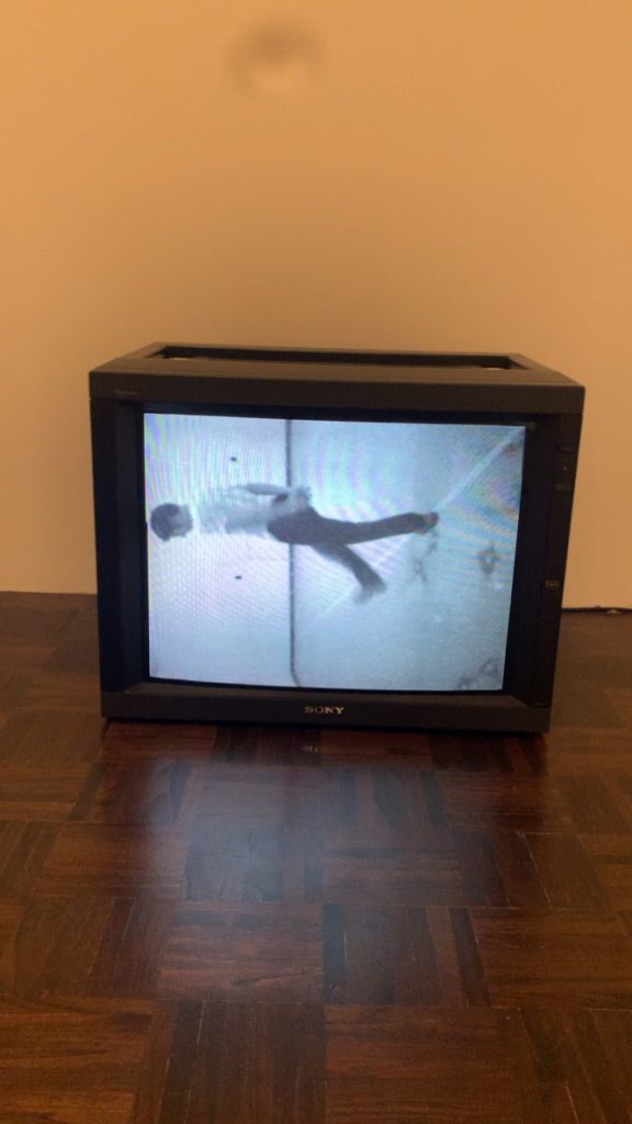
One piece I was able to see at the Metropolitan Museum of Art Bruer location on 76th street and Madison Avenue was, “Slow Angle Walk (Beckett Walk 1968) by Bruce Nauman. A fixed camera records Nauman as he repeats the same sequence of gestures: after kicking one leg up at a right angle, he pivots 45 degrees, letting his leg drop with a thump while extending his back leg at a right angle. According to the description on the wall next to this film, “These absurd motions take inspiration from the writings of Irish author Samuel Beckett, who described his characters’ awkward movements in excruciating detail.”


At certain moments, Bruce Nauman moves totally out of shot and only the noise of his footsteps indicate his presence. This way of treating his body with detachment through fragmentation and moving out of shot is reinforced by the perceptive confusion and the impression of weightlessness produced by the inverted space. In Slow Angle Walk (Beckett Walk), the spectators are confronted by a feeling of alienation which they experience while watching the artist in the doubly enclosed space of the screen and his studio.


Nauman abandoned painting for a wide ranging investigation of his own body as subject and object of his work, from latex and wax casting of body parts to a series of twenty-five films and videos.

In these latter works, the artist executed mundane activities in his studio – from walking and jumping to bouncing balls – where he explored “the kinds of tension that arise when you try and balance and can’t.” Nauman knew this kind of stripped-down, non-narrative movement from his association with Ann Halprin’s Dance Theatre Workshop in San Francisco which he was a part of for a while.

Two things that stuck to me about this film was the dullness and the creative use of the body to make sounds.

When I first came up to this film, I thought it would pick up or change at some point, but after about 6 minutes of the same action, I finally decided to read the description where it said that he did multiple hour long videos of these types of videos, and practiced for many hours at a time until it was perfect.  The intent wasn’t for the videos to be watching in its entirety, but rather something you could come back to throughout your visit to the museum.

The creativity in this piece, to me, was very unique because people walk every day, yet I’ve never thought steps could be seen as an artsy part of the human body. Nauman was able to recognize that and use it to his advantage to explore this new avenue in the art world and create something different.

What I was able to take away from this film was sometimes you just have to think outside the box and let your imagination take over, especially if you’re an artist or something of the sort. Also, it goes to shows how art can be expressed in many different ways and doesn’t really have a definition or look.


Slow Angle Walk Burce Nauman

NEW ORDER: Art and Technology in the 21st Century

The MOMA’s current exhibition New Order: Art and Technology in the Twenty-First Century is a collection of pieces which blur the lines between the two categories: Art and Technology. The exhibition consisted of various forms of media, sometimes even within just one piece. The artists included in this exhibition are all working to explore technology as something which is physical and tangible, not merely unseen codes and waves. It was very interesting to see the various ways artists are working within, and expanding upon, the place of technology in the future of art.

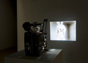
Of the works on display, I think my favorite, by far, was Made in ‘Eaven by Mark Leckey. The piece was a combined work of film and an accompanying sculptural component. The sculptural component was an EIKI 16mm projector which was positioned to project the film onto the wall in front of it. It is clear that the projector was meant to be seen as a feature of the piece, being that it was placed in a highly visible area and the film was not projected from a ceiling mounted projector. The inclusion of the projector in the piece led to the initial mischaracterization of the projected image as having been captured on film. After further inspection, it was clear that the image was a digital rendering of the artist’s studio and had merely been transferred from its digital form to 16mm.

What interested me so much about this piece was its backwardness. Today, it is so normal to transfer images from their analog form to a more easily handled digital form, but I have never seen this process take place in the opposite direction.

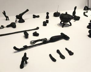
Another of the pieces I really enjoyed was Augmented Objects by Camille Henrot. This piece was made of various domestic objects covered in layers of tar. The artist purchased these objects from various places, including eBay, and then covered them in tar, making them effectively unusable. The statement for the piece described this act as “thwart[ing] the normal flow of objects, commodities, and digital networks of exchange.”

I was intrigued by the objects which were still recognizable, such as the old hair dryer and the TV antennas, but were obviously stunted by their transformation. It made me think about the way technology so quickly becomes obsolete, replaced by something faster, smaller, more functional. These objects also become useless, much in the same way that Henrot has stripped the usefulness from her objects. I also felt as if there was a gender component to be read in the work, being that many of the objects chosen were “domestic” in nature. Do these objects become relics of the domesticized woman of the past? Or does woman’s escape from isolation in the private sphere have an effect on the flow of these objects?

NEW ORDER: Art and Technology in the 21st Century

The Holy Mountain

I have seen Alejandro Jodorowsky’s The Holy Mountain back in high school and remember really enjoying it, along with his other film, El Topo. I recently saw a the IFC center where it still plays as a midnight movie.

The story is full of surreal and absurd imagery that tells a loose story of a christ like figure wandering around a land that resembles a hellish landscape that resembles the American southwest and Mexico. The figure meets an alchemist who takes him on as an apprentice and introduces him to seven other students who represent the seven planets of the solar system. Vignettes provide the backgrounds of each student, with all of them being despicable in their own ways, consisting of: a politician, an arms dealer, a to manufacturer, an architect, an art dealer, a police chief, and a cosmetics maker. The group then burns their money and their own images and goes on  a journey to find enlightenment.

Almost every shot of the film is beautiful and has imagery that relates to many religions, spirituality, and esoteric beliefs, as well as just plain surreal and often comically absurd. The first part of the film, which follows the Christlike figure, has a lot of references to the history and politics of Mexico. The commodification of Christianity, poverty, and features a scene of a reenactment of the Spanish conquest using lizards dressed as the indigenous people and toads dressed as conquistadors. The later part of the movie also has scenes which bring about the ideas of the exploitation of workers in factories, the cult-like fraternity of the police force and its suppression of protestors, as well as the desire for beauty through cosmetic enhancements.

Something that struck out to me that I didn’t think about when I first saw it was the use of animals in this film, especially their carcasses. The scene with the reenactment of the Spanish conquest features exploding pyramids where you can see the toads flying in the air. There are also shots of dead chickens being strapped to trees, skinned and crucified sheep. I don’t think I agree with the death of animals for the sake of art, especially in the amounts that the film shows. The part that bothered me the most was a dog fight that, if it was faked, would be very convincing. I understand the concept behind it but I don’t think any work of art is worth the direct suffering of animals to make.

The Holy Mountain

Made in ’Eaven by Mark Leckey

The installation that I found very interesting is called “Made in ‘Eaven,” and it was created by artist named Mark Leckey.  It is a short piece of video, the length of it is around three or four minutes. It starts very abruptly and later on becomes very slow and smooth. In the beginning camera shakes a little and it creates a feeling that it was shot handheld. After that it starts moving and it is very stable as if the camera is on the dolly or on a very good stabilizer. Viewer of this piece sees just a white room with two doors, one window and one very suspicious looking sculpture of what it seems like a bunny. The camera gets closer and closer to the bunny but the interesting thing is that the bunny is made of completely reflective surface and still we don’t see the camera coming closer. The camera starts revolving around this bunny and there is a moment when it comes closer to the presumable head of a bunny and it feels strange and bizarre. The wicked feeling occurs because we are looking straight into the bunny’s head but we don’t see eyes or nose or any other features. As the camera comes closer we see the reflection or a part of a room that is always behind the camera. And, it continues revolving in a close up for a minute and as it dollies out we see a window and what is outside of the room. As the camera gets further from the bunny we see two doors and the body of the bunny. In the middle of the video, the camera gets back to its first position where it started and bizarre feeling happens again because the head of a bunny reflects two red pillar looking parts of a room and they are reflected exactly on the part of bunny’s head where eyes are supposed to be.

However, the most interesting thing about the art piece is that the video  looks as CGI rendering and it probably is because the camera is two fluid and there is no other way how the artist could get rid of the reflections on a bunny’s surface. Although, the way this art piece is shown is very not contemporary or binary. It was transferred on 16mm film and it is projected to a wall from an old projector that loops the video. In the beginning, I personally did not realize that it was a computer generated video because it was projected from a film. My initial thought was a wonder of how they made the camera flow so smoothly. Also, watching it from a distance helped to seal the illusion that it was real. However then the bunny’s head moment came in on a screen and it was too smooth and with no reflection of the camera. Around that time the realization came that it was created on a computer. In close inspection though it was still hard to distinguish because the room itself looks very natural and the lighting is very real.

Made in ’Eaven by Mark Leckey

Andy Warhol: Screen Test 315, 61, 194

Andy Warhol: Screen Test 315, 61, 194

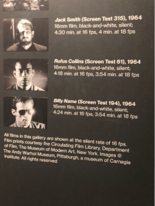
Andy Warhol’s pieces at the Whitney really surprised me. I found myself getting sucked in each time a film was playing. There was something so odd and entertaining about them. I wrote originally about Andy Warhol eating a burger which was very captivating. I can’t explain why but there was just something about It. However, while I was at the Whitney more of Andy’s work pulled me in. Some, in particular, was his screen tests. The Screen Tests are a series of short, silent, black-and-white film portraits, made between 1964 and 1966, generally showing the subjects from the neck up against plain backdrops.

What I found interesting about the films was how simple they were but also how complex. First off the lighting is set up to be harsh on the subject. It creates huge shadows and bright highlights. Secondly, the subject stands really still either looking directly in the camera or off to the side for a total of 3 mins. I did not learn that the projected movie was shown in slow motion as well which added to this uneasy feeling I got from watching the films.

I also felt like I was watching one of his paintings. The famous Marilyn Monroe painting, for example, was in my head when watching these films. I think it’s because the subject sits center in the frame from the neck up just like the paintings. I’m not sure if Andy was going with that but I wouldn’t doubt It. As I watched the screen tests I also was reminded of mug shots. The movie looked like moving mug shots to me and later when I did my research on the films I learned that Andy based this work off of the New York City Police Department booklet entitled The Thirteen Most Wanted. I found that interesting because I really felt like these could be mug shots. Another thing these films reminded me of was a horror movie. I felt like something scary was going to happen almost like a jump scare. They felt like old school horror movies because of the lighting and emphasis on shadows and highlights.

Andy shot these films on 16mm film, black and white. These films were silent and about 3-5 mins long at 18fps. I think he did a great job with them because even though they were only single shots of peoples portraits I found It very interesting and captivating. Watching It in a dark small theater helped too because I felt like I was watching something special outside of the exhibit. The environment added to the experience. The only thing I would have changed was the couple making out in front of me but I guess that can be part of a movie-going experience. All in all, I had a wonderful time at the Whitney and watching Andy’s films was eye-opening and a great experience.

Andy Warhol: Screen Test 315, 61, 194

MoMA New Order: Art and Technology in the 21st centruy (Donnell vers.)

Following up with the first exhibit I went to, I was taken to yet another museum exhibit about the use of technology within art. New Order is a compilation of older MoMA exhibits with use of many different interactions with technology, not focusing one a specific theme, but just one of general appreciation. The gallery held a range of levels of interaction between each of the pieces.
One example included a supermarket like display of bottles with inclusions of aspects of modern American culture. The items listed on the bottles were taken “literally” and ripped and dumped into the bottles. It proved one of my favorite pieces, as the items did not create a super ugly creation, but instead was aesthetically pleasing. Usually scathing social commentary creates something that looks ugly and is meant reflect the ugliness in the people watching This one looked cool, so I was actually intrigued to see what was in all of the bottles. Ironically, this may or may not defeat the purpose of the piece, but I enjoyed myself.
Another piece was a repurposed exercise bike with three monitors attached in front of it, so that you could look at the images as you pedal. I was more excited for the piece then I felt I should have been, because it ends up being this weird 3D woman who is supposedly supposed to interact with the bike. I was less interested about the supposed consequences of the peddling, and was in fact, more excited for the actual peddling. Being involved in the exhibit makes me excited, but I’m not sure if this was the point it was making. I still had fun for the minute I was on.
Lastly, there was this really weird video with weird 3 deletional object with an off-psychedelic vibe and house music, and an incorporation of a real-life video of and urban dance off. Making this piece more puzzling was the included introduction of it next to it, which included an author and a title, but no explanation to the artist’s attempt. It hurt my eyes. But it beat the piece of cardboard next to it.

MoMA New Order: Art and Technology in the 21st centruy (Donnell vers.)

“Country Ball” in MoMA

“The New Order” exhibition in the Museum of Modern Arts was definitely an interesting experience because I personally have never been there until a field trip with the class. There were a lot of fascinating showpieces that caught my attention and there were also that I found strange weird and uninteresting. However, there was a showpiece that seemed to be having both traits as almost being on the edge of weird and boring but also captivating and enchanting. This show piece is called “Country Ball,” and it was created by Jacolby Satterwhite.

There is something in this video that really captivates and one can’t just walk away from it. As Satterwhite said in one of the articles “Country Ball is an attempt to recreate a home video from the late 80s of my family’s mother’s day cookout.” On the first viewing, this video looked as something that came out of a very altered state of mind with a use of some psychedelic  substances. Although, it might still be the case, on the second more closer look on the video, I can really notice details and indeed images of people pouring and cooking something. In addition to that, there are 3D animated people dancing with real faces superimposed on their heads. Jacolby said that he had to “perform in front of the camera and green screen a hundred times; later inserting those videos into a virtual space to create Hieronymus Bosch “Garden of Earthly Delights” inspired landscape.” 3D space is also full of details and hand drawing and some real home videos inserted in the background. What I really liked about this piece is movements inside this 3D landscape.

There is a constant movement of the camera. There are a lot of tilts and pans and dollies and sweeps of a camera and it creates a momentum that engages a viewer and makes it so much more interesting and not dull. In addition, 3D generated figures are also always dancing of doing something and it adds to the constant feeling of movements. In terms of sounds, we hear a song and people having fun on a background. It definitely sounds as something coming from an old VHS tape because the quality of a sound is not that good. Overall, this video piece by Satterwhite is very unique because I could not help myself but to stay and watch it. The somewhat psychedelic visuals and very vibrant and oversaturated colors definitely played a role in. 3D environment was also very strange because there were almost no hard and sharp corners or structures, everything was very ambiguous and the shapes were bent or just weird looking.

Also, the small detail that I really appreciated was a moment in the end when two people figures seemingly try to put cards into a wallet and they keep doing it over and over while being strapped or chained to something. The first thing that came to my mind was the analogy with Greek mythology and a story of Sisyphus Rolling Rock Up to Hill.

“Country Ball” in MoMA

Eye Machine and Made in ‘Eaven

The two pieces that I found the most interesting MoMA’s New Order: Art and Technology in the Digital Age exhibit was Mark Leckey’s Made in ‘Eaven and Harun Farocki’s, Eye Machine I. The first features a view that revolves around the reflective sides of a Jeff Koons Bunny. The camera isn’t seen in the reflection because the video is a digital rendering that has been transferred to 16mm film. What struck me initially was the odd feeling of seeing a digital image on 16mm film, the smooth and unnatural surface of the sculpture and walls juxtaposed with the film grain. Leckey doesn’t own the Jeff Koons piece but he inserts it into his studio and then transfers it to a physical medium. The piece made me think of the way in which the current age of digital media and the internet has seen a blurring of reality and fabrication. The digital age is a time in which the authenticity of information posted online is subject to question, and ideas sprouted on the internet can manifest themselves into real life actions. In the way that reality becomes augmented, our senses are too.

I found Harun Farocki’s  Eye Machine I interesting in the way it demonstrated the precision in video technology developed for automation. The video features images of digital displays that automated machines use to perform their tasks, juxtaposed with images of video technology developed for the military. The video demonstrates the relationship between domestic and military tech, with the latter outfitting the former. The military has always been the progenitor of domestic technology but something about the fact that the piece focuses on video technology gave me an eerie feeling. The piece shows the sense that we all use in a cold and calculating manner, devoid of life. An aspect of human experience developed for analysis, data processing and precision that no person would be capable of.

Eye Machine and Made in ‘Eaven

Julien Donkey-Boy at Metrograph

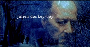
I really don’t like the movie Gummo, Harmony Korine’s gung-ho, mostly plotless, home movie-tinted ode to impoverished America. I find the film exploitative, generally unpleasant, and boring. (I recently watched the film again to make sure my opinion held up. It did.) I bring up my opinion of Gummo because Korine’s follow-up feature, Julien Donkey-Boy, is a very similar film in style, only this one has more identifiable main characters and even less plot. Critics savaged Gummo when it came out, and gave Julien Donkey-Boy similar treatment. Gummo has a lot of fans, including noted film directors, but I’m squarely on the side of the critics. So why do I like Julien Donkey-Boy?

Whereas Gummo had mostly non-actors from dark corners of Nashville, Harmony puts recognizable people front and center this time, including Gummo superfan Werner Herzog, and Trainspotting’s Ewan Bremmer in the titular role. Julien is a fast-talking, hyperactive schizophrenic. His sister is pregnant. His brother’s into wrestling. His father is tough on him because he wants his son to be a winner. They live in Queens. Julien hangs out with people with disabilities. And…that’s pretty much the whole movie. There’s no real plot, it’s just a series of vignettes involving the family, all shot through a shakily-maneuvered standard-definition digital camera. Actually, shot through a digital camera, then converted to 16mm film….then converted to 35mm film. The resulting image is very grainy and oddly-colored, giving the film a unique, deliberately terrible look, and that’s already assuming that it’s a scene where Harmony isn’t shooting with lower-quality cameras or filming what he’s shot off a television screen. It’s possible to see the film’s caution-thrown-to-the-wind cinematography as helping to put the audience in Julien’s kinetic mindset, or as presenting the film as a series of dysfunctional home videos. In addition, the film opens with a certificate saying that the film was produced under the guidelines of the Dogme 95 movement. One of the guidelines is that the camerawork must be handheld, and many films produced under the movement have similarly shaky camerawork. However, since Harmony appears to have ignored every other rule in the Dogme 95 guidelines while making this film, I’m not going to consider the movement in regards to his cinematography. I honestly have no idea why that certificate is even there.
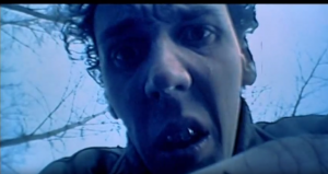
Julien Donkey-Boy is among the first films to be shot digitally, and it’s fascinating to see Korine take advantage of new technologies at such a young point in the medium. Scenes are shot a low frame rates using delayed exposure, giving everything a blurred, hallucinogenic look. Editing is rapidly-paced at times—to the point where one scene is entirely made up of half-second shots. His MiniDV camera can be maneuvered with ease, which he demonstrates with his frenetic cinematography. Digital video seems freeing to him, and the audience gets to witness him try out the tools he now has at his disposal.

One of my major complaints about Gummo was that I believed it used legitimately marginalized people to create a sideshow-freak aesthetic. While I admire Korine for giving such people parts in his film, it felt exploitive. Despite Julien’s recognizable main cast, many of the film’s supporting players are non-actors with physical or mental disabilities. Julien spends portions of the film at what appears to be a facility for people with disabilities, and there is a real sense of community among the residents that Gummo’s cast lacked. I really felt for Julien when he joins everyone in dancing at a birthday party with the others at the facility. There’s a sense of genuine warmth in this scene that is surprisingly not diminished by the fact that there is an extended sequence of a performer at the party eating several cigarettes and bringing them back up to smoke them. Also, Herzog plays cards with a man who has no arms, and therefore does everything with his feet. As this is a Harmony Korine film from the 90s, we are supposed to accept these events at face value.
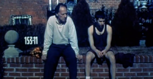
This brings me to an aspect of the film that has always intrigued me, which is that I’m not sure how much of it is staged. Many scenes in this film are shot and played out as if Ewan Bremmer went to certain public locations and acted like a schizophrenic. A lot of scenes in this film are shot like a hidden camera show, with the cinematographer shooting from a distance as Ewan improvises. This is especially curious in what I can loosely refer to as the film’s climax. Julien’s sister has just given birth, but the baby was stillborn due to an ice-skating accident. Julien takes the baby’s corpse and brings it home with him. (It’s heavily implied that Julien is the baby’s father.) What follows is a scene of Julien getting on a Queens bus with the dead baby as people look at him in confusion…and it doesn’t look like acting. The video quality is noticeably lower as well. It’s feels like the world’s darkest episode of Candid Camera.

While we’re on that subject, I’m not sure what the overall tone of the movie is. In one scene, Julien fantasizes about getting a call from his mother, who died in childbirth. She says that she’s a dentist in the afterlife and gives Julien tips on dental care. It’s rather absurdist for what should be a heart-wrenching moment. Plus, there’s Werner Herzog. Oh boy, is there Werner Herzog. He walks around the house with a gas mask on for no reason. He tries the string from the Venetian blinds around his neck and opens and closes the window by moving his head back and forth. He calls a stream-of-consciousness poem Julien created “artsy-fartsy,” before describing the “Do I feel lucky” scene from Dirty Harry at the dinner table with the reverence of an art film critic. It’s utterly hilarious. What exactly is Harmony going for here? A wrenching but heartfelt and funny portrait of a dysfunctional family? A rather politically-incorrect prank film? An excuse to have people just do random stuff in front of a video camera?
Maybe there was a reason Harmony made this a Dogme 95 film. The Dogme 95 manifesto said that directors were no longer artists, and set out to tell interesting stories while showing life as it really was. Maybe Harmony, 26 and already considered either the art house’s biggest pariah or a misunderstood genius, was trying to capitalize on a new and interesting film movement. Or maybe he considered this film a story of life that nobody else filming in New York City wanted to tell. A story of the marginalized and forgotten in the biggest city in the country. It’s rare to see something like this and Gummo released by a studio like Fine Line Features, a division of a major Hollywood studio and media conglomerate, and I haven’t seen much like it since. Harmony, meanwhile, seems to have moved on in the past few years. His latest film in his surprisingly-short oeuvre, The Beach Bum, was his first to receive a major theatrical opening, while his previous film, Spring Breakers, was his first major release in general. I guess he got tired of being “artsy-fartsy.”
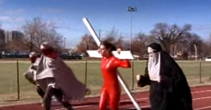
Side note: Metrograph preceded this film with a selection of two music videos and a commercial directed by Korine. The first features Bonnie “Prince” Billy’s No More Workhorse Blues set to a video of an African-American man with literal dollar-signs in his eyes and a woman in a bridal gown and blackface. The two do various activities, which are all shown in loops of a few frames each. The other video was for Living Proof by Cat Power, with a slow-motion scene of a high-school track meet where a woman is running with a cross on her back, with the other runners dressed in hijabs. They felt like videos from a karaoke machine you’d find in your dreams (or nightmares, particularly in the former video). An ad for Thornston’s chocolate uses similar visuals as the Workhorse video, with a young boy contemplating while people around him seem stuck in brief by repeating moments of time. Everything returns to normal when the boy realizes what wants–he was writing down something to be put on a personalized piece of chocolate. Harmony’s attitude towards promotional materials is that he knows he’s been commissioned to sell something, but nevertheless remains true to his experimental vision, if not fond of using controversy to attract eyes. Much of the Metrograph audience were amused when the final clip turned out to be an ad for chocolate–although I’m not sure what anyone would have initially thought that ad was for based on the imagery. I just hope Bonnie and Cat had seen Korine’s work before they hired him.
Julien Donkey-Boy at Metrograph

MOMA visit: Eye/Machine I by Harun Farocki.

Showing your work at a theater is tremendous entitlement. You have your audience’s undivided attention(hopefully) from the beginning to the end since your work is the only element to be observed in the space. In a exhibition setting, on the contrary, people would walk around wandering in their mind and attempting to see as many work as possible. As our professor perfectly described, “you’ll go out-of-fucks a man can give” by the end of a whole exhibition, I also found myself getting inpatient to finish a whole piece looking for something more visually captivating. However, my attention and curiosity were caught by some pieces which seem to share a similar theme: the duality of creation and destruction. 

The one I specifically liked was a 2 channel video installation called Eye/Machine I by Harun Farocki. I, as a media maker/filmmaker, point my camera towards people(my subjects) and scenery, which is determined by my human creativity and intention to tell a story. There are also other cameras that monitor, identity, and target objects for purposes like surveillance, quality assurance, and even attacking. Its origin comes from military practices and their functions are developed by a combination of algorithms, stored geographical data, and/or live footage. As Farocki points out how industrial production aims to minimizes manual work, there is a possibility of occurrence of war of machines. Although machines obviously have to be made by hands of human, they won’t need human’s brain and guidance to execute their task once they are produced. Through footage of military archives dropping bombs on specified targets from aircrafts, Farocki illustrates how emotionless and automatic machines are. Using two screens are effective in this case because it enables the artist to put more information, but right amount of graphic information to understand the story. Since having two screens next to each other adds another dimension, I actually got a little scared and intimidated by it and sensed urgency of the discussed matter. Footage from cameras located at factories to monitor machine’s effectiveness was very simple and repetitive, yet extremely powerful as they highlight how machines manage same heavy physical task repeatedly without exhausting themselves easily like human beings do. Theoretically and symbolically, the artist brings up intelligent machines’ capability to destroy, create and protect. Especially in military and war sphere, protection can mean a reason for destruction as they think they attack their enemies in order to protect their sovereignty and people. Thus, people are protected, but I cannot ignore the destruction that cause in other people’s lives and environment. This piece ultimately led me to reevaluate functions of camera and how it can be used in destructive ways.

I couldn’t help but notice some people stopped by to see a work, took some pictures, and left. So did I for some pieces, but I tried to take my time to fully appreciate each work. I red in other class that audience attention is, by far, the most scarcest commodity in distribution industry today. However, I realized that when we produce a powerful work, people will devote their attention and our story gets to the audience. That’s a good motivation to keep going!

MOMA visit: Eye/Machine I by Harun Farocki.