Nelson Crawford, Filmmaker @ MOMA

Nelson Crawford was a multimedia artist, and member of the 16-millimeter independent filmmaking scene in California and New York during the late 1960s through the early 1980s. The MOMA currently is running an exhibition, Nelson Crawford, Filmmaker, which is a display of nine of his works that serves as a meditation on the climate crisis and the sustainability of the earth. In some writing that corresponds with the exhibition, it talks about how from the contemporary point of view, Crawford’s work asks of viewers to “consider the impossibility of extracting the climate crisis from depictions of Earth’s beauty”. Traveling outside of the United States to Peru and Ecuador, the works included in this exhibition display a love and respect for the natural outside world, however these feelings of pleasantry are undercut by our contemporary awareness of the fragility of the earth and the “destabilizing presence of man and machinery.” (MOMA website). 

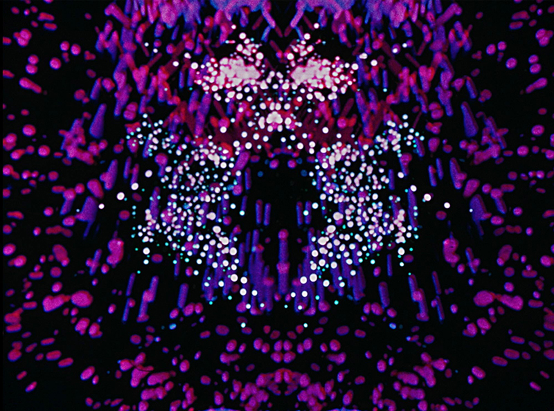
The first work of Crawford that visitors are greeted with is something of an abstract, avant-garde firework display. This short film was made in 1976 and is title “Paths of Fire II”. It is the only work in exhibition that seems to eschew images of the natural world for something more abstract and intangible. I was taken by this piece of media because it reminded me of the works of my favorite experimental animator artist that I always come back to such as Stan Brakhage. This one appears to be an anomaly when taken in context with the rest of the works in the exhibition, however it does possess the same wistful, meditative quality of the other works as one sees themselves getting lost in the images and finds that their senses become attuned and fixated only om the moving image and the rest of the outside world seems to disappear.
Once one takes the escalator down to the lowest level of the The Debra and Leon Black Family Film Center, they are greeted with the rest of Crawford’s works. These works are composed of images of the natural elements of Earth: water, air, and fire. The meditative aspect arrives from the simplicity and repetitive nature of these short films. The films are not complex, close-ups of an orange flickering fire that zooms out to reveal said fire is in a forest, panning close-ups of grass that cross dissolve into each other, close-ups of leaves on a tree. Displayed on different screens and running simultaneously, when watching all the screens together, one sort of gets the sum of its parts, or a greater narrative that Crawford is reaching at about ecology and the protection of the natural world against human forces that intentionally and unintentionally are working against our physical world. Crawford sought to capture the tiniest details in nature, the tiny holes in the leaves, the direction the grass sways, and so on. In capturing these minute details, Crawford highlights how complex the natural world is, and how one can always discover something new and intriguing in the natural world, only if it still exists. I really enjoyed the Nelson Crawford, Filmmaker exhibition because the issue of the climate is one that is existential and of the utmost importance and I really admire Crawford’s ability to understand and integrate that message into his work as far back as the 1960s. I also admire the filmmaking of Crawford’s that is showcased in the exhibition as it is so simple, but immersive and contemplative.
Nelson Crawford, Filmmaker @ MOMA

Liquid Reality exhibit @MoMA

This week I went to MoMA on 53rd st. to experience the Liquid Reality exhibit created by Shigeko Kubota. Having never been to the museum before I found myself searching for the exhibit for quite some time. This was actually great for me because I got a chance to view tons of other interesting work before finally arriving to Kubota’s exhibit, which was located at gallery 414. I didn’t know much about the artist or her work other than a brief description of her style on the  MoMA website. I did know that the galleries description along with the title of Liquid Reality sounded strange and appealing to me. The description noted the artist’s work to revolve around concepts of technology, nature, time and light. While this was all pretty vague to me, I was pleasantly surprised when I viewed the work and found it to be intriguing, playful, pleasing to the eye and contain a quality of interactivity. 

It was very clear from viewing the work that the artist was fascinated with video and how it could be manipulated, interpreted and heightened through the use of reflective materials as well as natural elements.  The first piece that I noticed was a series of obtuse video screens, suspended in colored glass, propped up perpendicular to a rectangular pool of water. The piece seemed to be making use of so many things at once: the light from the ever-changing distorted screens, the transparency of the glass and the outside environment, the shimmers of colored Reflection off the pool of water, and the sharp green glow that bounced off of the liquid that projected onto the floor of the exhibit. 

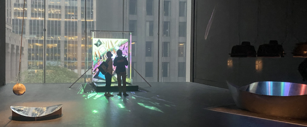
This was followed by a piece that consisted of flat, black, chromed sculpture on the ground. Above it was a suspended, space-aged orb with a small video monitor playing under it reflecting off of the black sculpture. The Kubrick-esque orb swung from a rope of wires, constantly distorting the image reflected from the chrome structure. When I finally placed myself in a good position to view the moving image, I realized that the video was of me looking down searching for it.  

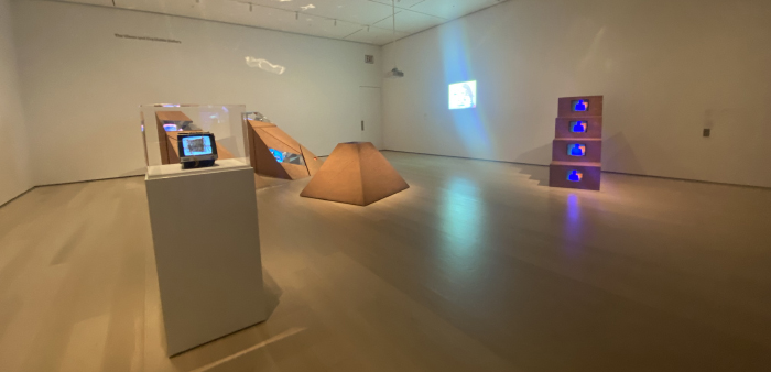
There was a piece that appeared to be a wooden pyramid with the tip missing. As I approached the piece I noticed kids and other museum attendants struggling to peer over at the opening of the pyramid to snap an iPhone picture. When I got as close as humanly possible too the piece (literally touching it) I saw that inside this pyramid was a kaleidoscopic array of mirrors and colored light. It then became clear that the purpose intended was for the viewer to have to lean over the piece in order to view what was inside. 

The overall experience was thought provoking, but still very fun in a traditional sense. I got the feeling that the artist wanted a certain reaction from the viewer that strayed from the run of the mill, scratch your chin and and raise one eyebrow. The viewer was meant to discover ideas and different levels of reality being expressed through the process of the viewing the art. 

Liquid Reality exhibit @MoMA

Liquid Reality MoMA Exhibition

Shigeko Kubota’s, Liquid Reality Exhibition, is an immersive viewing of videos using sculptures, essentially destroying the constraints of viewing them through a TV box. Kubota being among the first-generation artists to embrace video, uses different filming techniques and editing to distort how videos should be viewed and how they can corporate nature, technology, and time. While visiting the exhibition, the light room had works of plywood and sheet metal all taking on a structural form of what the videos constituted.  Three Mountains, for example, was footage from three different terrains shot by a moving car but installed inside a mountain (pyramid-like) structure and with distorted mirrors and angles. This work along with Duchampiana: Nude Descending a Staircase, utilizes structures to present distorted video footage but this alone combines the creative aspect of having a stand still structure play moving film that evokes time stopping for the person viewing the work. Interestingly, I was more surprised by her first work Berlin Diary: Thanks to My Ancestors, just the use of having handwritten kanji tied on top of the small television with its static background truly invokes the idea that viewing video can be transformed into a creative artistic element.

            While the light room exhibition was thoughtful and truly showed the origins of what Kubota portrays, the dark room opposite to it with its similar techniques personally leaves viewers more transfixed. Using mirrors and flowing water creates a stronger aesthetic along with the low illuminated room making the water’s light reflect on the walls and floor. This side of the exhibition had three works starting from the Video Haiku-Hanging Piece which creates a visual representation of a poem from a hanging pendulum ball where the video is reflected from the ball to the mirror on the ground. Only viewers who are present at the time can view the video on the mirror being stretched by the swinging ball. River and Niagara Falls are similar because they depend on the use of water flowing and the videos being mirrored by the water for us to view the video, looking at the flow of the water as it moves in time. Here again we see the relationship of a structure and its video viewing, how both overlay one another to trap us into a fall-sense of moving with the video but standing still through it.

            Unfortunately, the dark room was more favorable to the audience at the exhibition rather than the light room and I could understand that most would find the aesthetic structures more intriguing. However, it feels that as we walk through the exhibition starting from the light room to the dark room it connects with one another to showcase the emergence and growth of video visualization in time and creativity using stand-still structures. Sometimes we can find viewing videos to a simple activity and not much work is needed to enjoy what we watch, but when we let go of viewing video constraints, I understand how Shigeko Kubota wanted to create a form of artistic work. While her videos may appear distorted, the simple act of having to be present in time to truly view them being reflected in the structural works and adding nature in her work just makes the footage realistic.

-Yoselin Castelan Ramirez

Liquid Reality MoMA Exhibition

‘Midden’ Greater New York, MoMA PS1

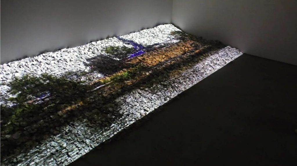
Last Sunday, I went to MoMa Ps1 to explore some experimental videos of Greater New York at MOMA Ps1 in Long Island City, Queens. I got to the place where they were supposed to have their video playing in the basement area, and then I heard something familiar. I had been watching those native films for my American History Class, so I could tell that it was Native Indian sound, but they had nothing projected on the wall, so I thought it hadn’t started yet. Later, I noticed that the video was already being played, projected on the floor that was filled with pebbles.


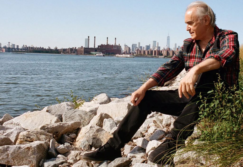
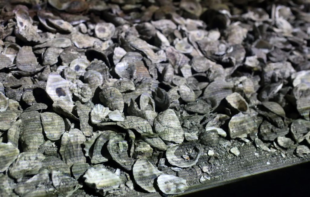
They had this video called “Midden” by renowned artist Alan Michelson. Born in Buffalo, he grew up in Boston, and, after attending Columbia University for a time, returned to New York in 1989. “Midden” refers to monumental mounds of oyster shells that were present when Dutch colonialists started to settle in present-day New York City.
Many of his pieces were horizontal, reminiscent of early panorama art and the woven wampum belts that served as a cultural touchstone for his people. The artist’s obsession with shorelines as liminal zones had led him to go from southern Ontario to Queens to capture video from the bows of boats.

He had the Gowanus Canal in Brooklyn projected onto tons of oyster shells placed there to make it look like a shoreline. You don’t see natives playing their instruments, but you can hear the sounds of songs and drums from behind. The video art in a way feels like a shadow, but then the shadow would not be in color. The video seemed to show the cityscape along the river being shot while driving around or from a running train. You would see the cityscape and water a little opaque but in color and, surprisingly, without the sky part, completely transparent
Michelson does not consider himself an “environmental artist.” But he has long been preoccupied with the destruction and transformation of the Indigenous environment by colonialism. Michelson’s doing something different to leave people in wonder and present his brilliant art through which he could pay homage to his people, the Lenapehoking, and their ancestral homeland was a brilliant idea in itself. I did not know that he himself was Native American until this point. Also, I subsequently discovered that the melody playing in the background was the music they used in the Delaware skin dance.


According to what I read, Michelson would go to New York City’s local restaurants and collect oyster shells, reseed them, and carefully release them into the sea. Now, as I have mentioned above, these native Indians wear bracelets that are made out of the pink part of the shells, and they call this wampum. This wampum not only has aesthetic value, but it also has spiritual value, and his collecting that massive number of shells to make it noticeable from all around or say to give it a louder voice to the cause he is working on is great art. Personally, I believe this video art was experimental for Michelson, but it has already contributed a whole new dimension to modern video art. I never thought in this way that one could utilize their art to have their voice heard in a broader social arena. I think more and more new artists like myself will be inspired by this genius art in the coming days.

See Ya..

‘Midden’ Greater New York, MoMA PS1

The New Order Art + Tech in the 21st Century @ the MoMA

The New Order Art and Technology in the Twenty-first Century is a collection at the MoMA that creates art from the disruption of technology. “The show features works made since the turn of the millennium that push and challenge the boundaries of technology: upending systems, experimenting with materials, and ultimately inventing novel techniques and substances.” (MoMA 2019 p.3)

One piece I found interesting was the 23-minute video insulation which is played on a loop. The film which is called  Eye/Machine I, II, III (2000-2003) was created by German filmmaker Harun Farocki. Farocki explores the question of how military image technologies find their way into civilian life. The images in the film were taken from missiles, real-time photographed/film of droppings and the (computer) simulated images of the Gulf War in 1991. The Gulf War is said to be the starting basis for electronic warfare.

The film is centered on the images of the Gulf War which caused a worldwide sensation in 1991. The shots taken from The loss of the ‘genuine picture’ means that the eye no longer has a role as a historical witness. It has been said that what was brought into play in the Gulf War was not new weaponry but rather a new policy on images. In this way, the basis for electronic warfare was created. All the works presented are double projections. The dual images serve as a comparison between idea and reality, a confrontation between pure war and the impurity of the actual. This confrontation is also a montage and montage is always about similarity and difference. According to Harun Farocki In a double projection, there is succession as well as simultaneity, the relation of an image to the one succeeding it as well as to the one next to it.

My favorite piece of the exhibit was Josh Kline’s Skittles, which was a commercial refrigerator filled with fifteen different smoothie flavors line the shelves of Kline’s lightbox–encased commercial refrigerator. Each bottle lists the unorthodox ingredients contained within, including latex gloves, octopus ink, Ritalin, and Google Glass eyewear. Each drink has names like Big Data, Supplements, Minimum Wage, NIghtlife, Williamsburg.


I found this piece to be a satirical commentary on today’s society, a message to the upper class who can afford these luxury $10-15 drinks that the smoothies are modeled after. Each drink is made up of a mixture of ingredients that are indicative in these places such as Kmounbca, Kale chips, and microbrew being ingredients in the Williamsburg drink. Each formula evokes the economies of goods, services, and technologies that surround us, infecting everything from our diets to our sex lives. Skittles has to be made anew each time it is shown, and it will morph and decay during the course of the exhibition. The ever-shifting solutions suggest the ways in which our bodies have been engineered, chemically altered, and transformed by technologies of consumption.

The New Order Art + Tech in the 21st Century @ the MoMA

Dim Beam Simulcast (2109) by Amia Megumi Yokoyama

This gallery in Bushwick had an art installation with a giant painting that dragged on the floor, complete with slippers to walk onto the painting so you could get even closer. It was a Friday night and there were lots of people talking loudly. I was reading the artwork’s description when I read that she also made video art, and low and behold behind a crowd of people was a puny flat screen on the wall playing a 24 min video on loop. The video clearly had dialogue, but the poor speakers were nothing for the mass of people, so I tried to gather as much as I could from the visuals. I never grasped the story without the dialogue, which makes me consider all of the considerations for gallery video art. The imagery without dialogue or context felt like a random assortment of imagery to just be weird. There was a sterile hospital environment with workers working by themselves wearing colorful experimental or futuristic clothing. One person on a typewriter was eating candy and getting scolded for something. In another scene, it appeared to be some sort of control room where everyone still wore the same type of clothes but with old computer keyboards and a girl dancing on a pole. There was some tension that broke out, but without dialogue it was unintelligible. Overall, it was a let down because of the sound, and I would like to hear it in another context, like youtube!

Dim Beam Simulcast (2109) by Amia Megumi Yokoyama

Emissary Forks at Perfection (2015-6) by Ian Cheng

The first line of the description for this video art installation is “a video game that plays itself.” It plays live like an infinite dream sequence of Talus Twenty Nine, an artificial intelligence being who oversees the terrain. Each time the program is run, something different happens, much like the spontaneity of a human life.
The ongoing nature of the algorithm shows how AI can be programmed to interact in a way like humans, but feels ultimately repetitive and limited. Although the sequence was different every time the program is run, it was still the same ingredients all senselessly interacting. It serves the gallery space well because it can be something to ponder for a moment then carry on, still mostly absorbing the piece. I felt that after 12 minutes it was starting to feel like I wanted to move on. Using AI and technology to help humans process data, numbers, and store things makes sense to me, but teaching computers to do human things like dreaming and imagining seems dangerous and, at this point, way inferior than our own imaginations. What was lacking in the work was any semblance of a narrative, and so it could never feel truly human, but should we be trying to build technology that is as human as us?

Emissary Forks at Perfection (2015-6) by Ian Cheng

Minute Bodies: The Intimate World of F. Percy Smith by Stuart Staples

On April 4th at 10:30pm, Metrograph showed Minute Bodies (2016) as part of its late night series. While I was worried that I would fall asleep to a wordless, conceptual piece so late in the evening, the lively jazz music paired with an intimate peek at the microscopic and macroscopic natural world kept me in awe of the patterns, shapes, and forms that are apparent at every amplitude of nature.
With much of the time-lapse video showing the growth and movement of various organisms, such as roots, sprouts, spores, shoots, flowers, frogs, and ants, I saw the dance of nature in all its subtle, time-less glory.
I know very little about F. Percy Smith, but this homage to his work convinces me to investigate further. In the credits, I saw that his documentaries number in the dozens! This documentary was made by Stuart Staples to pay homage to the work of F. Percy Smith. This narrative, if you can call it that, was as chaotic and spontaneous as nature. But evident in the spontaneity are the rhythms that flow from it. The music of the film utilized various instruments, but always seemed to match the intuitive, improvisational style in jazz, which only emphasized the infinite patterns of nature.
The audience seemed to be awake and actively watching the film, especially because the theater was giving out all their popcorn for free since they were going to throw away at the end of the night. I heard the constant chewing of popcorn as well as the occasional gasp or giggle at the funny interactions on the screen,
The film is a short 55 minutes, but gives you enough time to really settle into it. At what would be the climax, there is an overlay of time-lapse growth scenes that replicates fireworks as foliage and mold spray and spew in networks so fast with the music that it is almost a celebration of life in the natural world. Overall, I found this film to be inspirational!

Minute Bodies: The Intimate World of F. Percy Smith by Stuart Staples

We the People: Nari Ward @ The New Museum

The Nari Ward Exhibit at the New Museum is a collection of sculptures and art pieces that address inequality, racism, poverty, and rights in America. Ward who a CUNY alum and longtime professor at Hunter College, created these large pieces in this two-floor exhibit that were often composed of found objects that hold dual meanings. From the forgotten trash Ward creates over thirty sculptures, videos, and paintings that span from 1992 to 2018. Through his, work Ward tells the story and shares the pain of the underrepresented and often forgotten. Many of the sculpture pieces in the exhibit also contained a technological aspect usual a sound or light, which brought these pieces to life.

For example, the title of the exhibit; We the People (2011) was displayed in right by the entrance is made up multi-colored shoelaces often used in basketball shoes or sneakers. With the use of shoelaces the words which are the famous introductory words of the US Constitution and signal of democracy, freedom, and rights now also include African Americans and minority population who are often the wears of these type of shoelaces.

One piece I especially like was “Glory” (2004) which was is an oil barrel turned into a tanning bed with fluorescent lights, the inside of the bed contains stars and stripes from the flag. Along with the exhibit is a whistling version of the US National Anthem. The tanning bed holds a dual meaning, (1) it is made of an oil barrel and its and presentation with the flag and the national anthem tie in oil with the essence of America (2) tanning beds which are often used in suburbia, allow for users to create an ideal image and for this image to be replicated to others, in other words the placement of the flag inside the tanning bed, sent the message of manufactured patriotism.

Another piece I liked was called  “Spellbound” (2015) is a piano covered with used keys, and video of footage of floorboard breathing holes that was used by escaped slaves who hid there. The keys represent freedom and release.

When looking for something to write about for the blog, I was nervous that Ward’s exhibit would not be considered experimental, but I think because many of Wards pieces hold dual meanings and use a variety of mediums that can also fall into the experimental category. Overall I really liked the Ward exhibit I am not sure I understood all of the pieces but the ones I did were especially powerful and the ones I didn’t were still interesting. The exhibit is still currently open so hopefully, I can visit us again and maybe go on a guided tour. I also think it’s really cool to see a CUNY alum who is successful in the field of art.

We the People: Nari Ward @ The New Museum

The Programmed: Rules, Codes, and Choreographies in Art @ The Whitney

The Programmed: Rules, Codes, and Choreographies in Art, 1965-2018 exhibit at The Whitney Museum explores artwork created at the intersection of technology and art. The pieces in this exhibit examine the thin line technology can play in the distribution of “traditional” art. Each piece uses technology to highlight the effect automation and computation can have on a piece of art and the artist straddles a fine line of “traditional” art and technology.  Many of the pieces such as America’s Got No Talent actively critique the increased use of technology and how they affect and shape our society. America’s Got No Talent, a web-based art piece by Jonah Brucker-Cohen and Katherine Moriwaki which used the American flag as it backdrop to display and graph tweets. Each strip in the flag represents a reality TV show with the word “American” in it.  

I found this piece to be the most interesting because as Moriwaki one of the creators says, “those talent shows and contest shows really play into that, this kind of deep-seated dream that––you know, you can be nobody or anybody—in the United States and find fame and fortune. And in fact, this way in which basically, social media has created stars, created celebrities, it was something that we wanted to comment on, so the piece kind of speaks to that and speaks to the echo chamber of social media.” America’s Got No Talent explores the theme of American meritocracy and the rise of fame for the purpose of fame rather than talent.

Another piece of interested would be the main show stopper piece, the centerpiece of the exhibition was Nam June Paik’s Fin de Siecle II, which a huge, newly restored, multi-channel 1989 installation. The piece has not been displayed since its original showing at a 1989 Whitney Museum exhibition which it was created for.

The piece work consists of 207 televisions, all of which are older, cathode-ray tube models from the time of the work’s creation is accompanied by a booming electronic base and a montage of images pulled from tv shows, music videos, and advertisements. Images of David Bowie, a man and woman dancing, piano keys, naked women walking against a fleshy backdrop,  and a number of other images that move too fast for the brain to process. The sculpture serves s commentary on how digital content saturates our lives, and in the age of Youtube, Memes, iPhones, and Influencers, the restoration of this piece is particularly needed.

Fin de Siecle II also helps to decide the exhibit into two, the first displays pieces from artists like Josef Albers, Donald Judd, and other mid-century artists the use algorithms to create paintings, sculpture, print work, and simple projections. The second display pieces that focus on “the use of instructions and algorithms to manipulate” to create digital art pieces using television programs, sets, and signals, or image sequences and like Paik’s piece, Brucker-Cohen and Moriwaki piece many of the works serve as a critique on society.

The Programmed: Rules, Codes, and Choreographies in Art, 1965-2018 exhibit at the Whitney’s collection, looks back at predecessors of computational art and shows how the ideas addressed in those earlier works hold up and have evolved in contemporary artistic practices.

The Programmed: Rules, Codes, and Choreographies in Art @ The Whitney