Liquid Reality (Shigeko Kubota)

by Max Sackett

When I first got to MoMa, I was excited because I had never been, and it had been a while since I had been to any museum. It had been at least 2 years. When I arrived at Kubota’s exhibit I was a tiny bit confused. I sort of expected something more concrete. For example a screen with some sort of story or narrative. Not that I was expecting a film per se but something a little more visual as in video from then a structure with several videos displayed around it.

The piece was gonna be what I wrote my original blog post about however I wasn’t sure that I really understood it. I think of myself as someone who is pretty intend with creativity and art, yet the piece just did not speak to me. I also to be honest was a tad confused about what the piece was. There were several structures in exhibit and I was not sure if they were all part of it or if it was just the one in the center. The signs surrounding the pieces were not as helpful as I hoped in relieving my confusion. 

As for my understanding of the piece it comes to me jus to simply be a piece of art. rather than something that has a message or a meaning. I find it soothing and relaxing to look at. As someone myself who thinks art is subjective I appreciate the abstraction in these pieces.

Shigeko Kubota was one of the first of her generation to incorporate video into her art work. Before this most visual artists worked in more simplistic and old fashioned ways such as sculpture, paint and drawings. Kubota brought video into her art, which typically had only been seen on television or film. There was no social media or Youtube for people to create visual art on. It had to be something that was genuinely created.

Liquid Reality (Shigeko Kubota)

The Flying Train

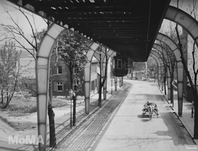
“The Flying Train” was by far the video that fascinated me the most. The technical wonder of having a suspend rail going through town before automobiles were vastly available feels like something out of a movie about a futuristic world, like “Metropolis” or “Dark City.” Also, as Edison had 35 mm film patented, Willian Kennedy Dickson left the Edison company and started Mutoscope, which became the biography company had the come up with a new format, so he invented the 70 mm film. This spectacular format captured a vast amount of detail, and it was shot at 30 fps which gave a much more natural motion than Edison’s 35mm. The movement motion is so smooth and natural that I had to research how they did it; after learning that it was not done by interpolation, but it was shot like that, I  was genuinely amazed.

“The Flying Train” takes us on a suspended ride in 1902 Germany, which its original footage, of the early days of cinema, yet feeling as natural as any contemporaneous film feels. It is believed that the 68 mm nitrate film found has initially been a 70mm film that shrunk with time. The footage and ride are utterly unique. I also found some other movies and more information, which I added the links below. The film is about 3 minutes long, but it mesmerized you into watching it loop over and over. German citizens go on their daily lives below the suspended train, unaware that they were being filmed. The town of Wuppertal in Germany still had a very rural feel. The ultra-modern train for the era travels through, giving us a foretaste of how Germany was 120 years ago in great detail and realistic motion without any interpolation to make the material have a natural movement.

“The Flying Train” is one of the documentaries with camera movement. Together with the rest of Dave Kehr’s “First Films” series, it is part of an impressive part of history, cinema history, technical developments in arts and transportation, and the everyday life in an era we often only see recreated in modern film or interpolated film. “The Flying Train” is a simple yet honest and beautiful film, which show us how in many ways, the industries have not evolved as it could due to their financial goals.

As an avid film shooter, who often promotes the importance of keeping shooting in the film as the cost responsibility forces everyone to refine their craft and ensure that they are doing the best they can. “The Flying Train” further reminds me of how if companies had not been so profit-driven mainly by cost, we would be much more advanced than we already are. Especially when anyone can pick a digital camera, call themselves an expert filmmaker even when depriving minimal creative and cost responsibly.

The Flying Train

News From Home

Jon Paul Cabas                                                                                                                 12/19/21

     While watching Chantal Akerman’s News From Home , the presentation of  addresser and addressee really popped out at me. I had seen the film before but felt like I found a new appreciation for it while watching it again. I like that we never hear or see from Chantal Akerman except for when she reads her mother’s letters. We don’t know exactly what Akerman said in her responses, leaving us with only half of the interaction. This presentation of the mother’s letters makes the addresser and addressee identities become the same, creating a unique form of communication. Another thing that stood out was the occasional interruption of the voice-over by the loud ambient sound. When I watched the film the first time, I wasn’t entirely sure if these moments were left in on purpose or not but on a rewatch it became clear to me that it is entirely intentional. These moments disrupt the sense of closeness between Akerman and her mother with the reality that they are actually distant. You can try to read a moving letter from your mother who’s on the other side of the world, but the sounds of the New York subway will likely make that difficult. 

      Akerman is clearly interested in the scope and space of New York as well as movement within different spaces, which she captures well in this documentary. One scene inside the station captures many people entering the station through stairs as well as people moving towards and past the camera as it’s fixed in the middle of walkways. Most of the people who pass the camera stare at it intensely which made me feel like I was there in place of the camera. Every shot feels like it could be from Akerman’s point of view which we are also inhabiting. One striking moment in the station was when the camera panned endlessly, following a moving crowd of people. This shot definitely gave me a slightly uneasy feeling as the camera forced me to follow people who may or may have not wanted to be filmed. Somehow, just being a viewer of the film made me feel like I was directly responsible for possibly annoying some of the passersby. The scenes inside the subway car are just as interesting, especially because the space is a lot smaller, making the possible angles a lot more restricted than in the station. In these shots, the camera was either fixed on the subway doors or the passengers on the train. Even though the camera doesn’t move, these shots come alive through the people’s expressions within the frame as well as their entrances and exits of the frame. 

     The voice over and the ambient sound mostly work as two layers of sound being played at once. The few moments where the ambient sound temporarily drowns out the voice over are instantly noticeable and serve as a reminder to the audience of the space we’re in. The content of the letters are specific to Akerman and her family’s struggles, desires, etc, but they also felt like bits and pieces of a story being told to us. Obviously the letters are real but they have a narrative quality to them when they’re read in succession of one another throughout the documentary. The emotional tone changes a bit from each letter but almost all of them give off the tone of a worried mother who misses her daughter and who is struggling to keep everything running at home. The mother’s letters occasionally take on a frustrated tone as she constantly begs her daughter to “write more often.” 

News From Home

Robert Greene – Procession

This time around I went back to MoMA to watch a film by Robert Greene called Procession, a documentary film filled with cinema drama therapy that takes a different approach for a healing process of six adult survivors of child sex abuse in the Catholic church. The opening of the film was unlike anything I’ve ever seen, it had the re-enactment of one of the survivor’s stories but more than that it used CGI to alter the reality and give it a more symbolic meaning. I’ve watched many documentaries over the years, and Greene gave it such an experimental touch that it doesn’t feel like I was watching one at all. Firstly, the involvement of the survivors themselves taken control of the film and being the ones to narrate it all as well as being the ones to play acting roles on their own traumatic scene felt unique.

Procession. (L to R) Joe Eldred, Ed Gavagan, Michael Sandridge, Tom Viviano, Dan Laurine and Mike Foreman in Procession

The topic of child molestation and rape inside the Catholic church is criticized in the media but worst of all, the Catholic church has been known for protecting its members. I felt immersed with the film from the beginning because I also come from a family that practices Catholicism, was baptized as a baby, did my first communion, and went to Sunday church with my family. As a child we’re made to follow the religion of our parents and as one of the survivor’s said, “the Church holds power on us the moment we’re baptized”, there’s something almost wrong about how true his words are and how the Church continues to be corrupted to this day. I’m not a religious person anymore but this film didn’t badmouth religion or for that matter none of the survivors were anti-religious instead they focused on the people itself.

Usually, while watching a documentary there’s this strategized almost beginning like timeline of the events that happened following up with interviews of the people involved and fictional scenes to recreate the event with different actors. But there wasn’t anything like that in the film instead the stories of the survivors were told as they talked casually and while writing and reviewing their scenes with one another. It felt almost too personal for a documentary, the men had control over their scenes, and they played the role of the perpetrators too. Drama therapy was something I’ve never heard of especially being shown in a documentary film, the approach that Greene took made the topic even more raw.  

The film although shown as a documentary didn’t feel like it was one fully because of the behind the scenes being shown in its reality. It was more of a nonfiction film about healing and that’s what Greene is known for as a filmmaker of modern nonfiction cinema. The ending as well was one of the survivor’s reading a letter to his younger self (the child actor) where he writes how he will move on and that it wasn’t his fault. It all ties together with what they want the film to mean for them and the future and to all the other young boys who share the same story as them. All six men knew the documentary film would either be received good or bad but what mattered most was to get their story out. Greene’s used experimental directing and filming to give the survivors a chance to heal on their own film.

Yoselin Castelan Ramirez

Robert Greene – Procession

Marta Minujín’s MINUCODE

I previously went to M0MA to view Shigeko Kubota’s Liquid Reality. While I was roaming around searching for the exhibit I came across Marta Minujín’s MINUCODE. I was interested instantly but was too invested in the search for what I came to view that I made note of the interesting piece and went on my way. I have since came back to MoMA with the purpose of returning to the interesting room I had walked through with out fully taking the art in.

The room was fairly empty and most of those who walked in stayed for a few moments and then went about their lives. I stood in the center of the room and was surrounded by moving images from a series of recordings of a cocktail party of some sort. Vintage dinner jackets and small moments of human gestures filled the walls around me. It felt almost as if I had crashed the party and just came to eavesdrop. I then began to slowly walk around the room closer to the images projected onto the four walls. I wondered why these people where there. What they were talking about? Were these co-workers? Was it a high school reunion? I then tried to focus on just one wall, timing out when the camera would cut and repeat again. I couldn’t maintain my focus and found myself having to scan each wall to find some kind of moment that stood out. Because of the low volume and overlapping pieces of sound I became more and more interested on the little gestures that these people were making. I wondered how aware they where of the presence of the camera. They didn’t seem to be acting unnaturally or putting on some kind of performance. I then read about the piece and the artist.

The name of the piece was a combination of the artists name, Minujín, and the word code. The relevance being the intent to view specific human social codes. Minujín conducted a series of four cocktails parties in 1968 where she invited people who specialized in fields of art, fashion, business and politics. She invited them through newspaper advertisements and received over a thousand replies. She then made a questionnaire to categorize those who replied by their interests and profession. Once she created the guest list she hosted four parties over the course of four consecutive nights. Once the footage was complete she then invited those who attended the parties to come and view the footage. She screened the footage for them in hopes that they would observe themselves “backwards”, to watch their own behaviors and social interactions. Part of the inspiration came from Minujín’s interest in Marshall McLuhan’s theories of mass media. His thought was that society is far more effected by the quality’s of the mediums used in media, then the actual content being consumed. I’m not entirely sure how this theory translates to the piece MINUCODE, but I enjoyed it all the same.   

Marta Minujín’s MINUCODE

IF REVOLUTION IS A SICKNESS- SCULPTURE CENTER

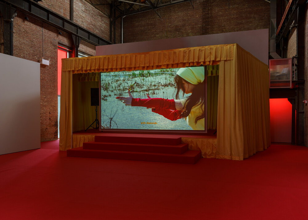
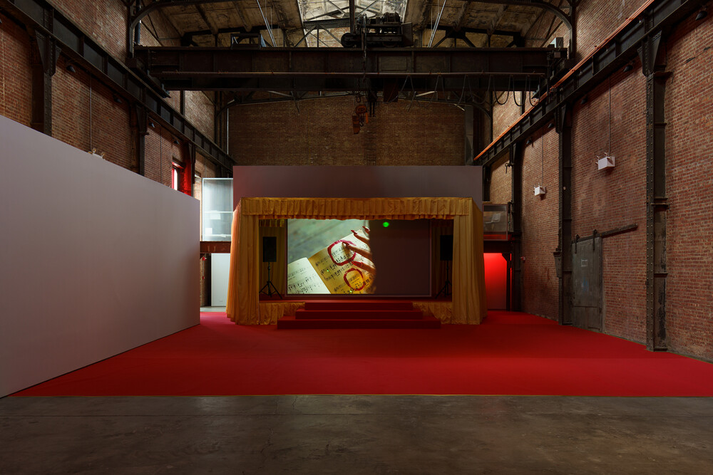
For this blog post, I decided to visit the Sculpture Center last weekend with my sister, located in Long Island City, Queens. The exhibition was titled IF REVOLUTION IS A SICKNESS, by artist Diane Severin Nguyen. We were given a pamphlet to read before we entered the room. We noticed quickly that we were the only ones there. This room was quite interesting because the stage had a big gold curtain and red stairs, it looked like a theater performance was about to begin. The red stairs led down to a big red carpet on the floor, there were no chairs for anyone to sit. We sat on the carpet to watch this performance.  IF REVOLUTION IS A SICKNESS started with beautiful shots of the trees in winter and summer. The shots that followed showed young Weronika, asleep on the shore and we could hear the voice-over of a man reading a letter that he wrote for Weronika. He started to talk to her about politics and the change that had to occur. The voice says, “promise to communicate our problems… isolation will destroy you.” The next shots showed Weronika strolling all alone throughout the forest, but it seemed like she didn’t mind it, it looked like she was comfortable on her own. The voice went on to tell her “you cannot stay, you cannot avoid certain things. Isolation strips you, which is a hard pill to swallow”. We eventually saw Weronika grow up into a teenager. She was still wearing a red and yellow outfit like she wore when she was younger but she was no longer isolated from the world. She was ready to have the entire world listen to her sorrows.  We saw her practicing how to sing and dance K-pop songs with her polish friends. She stood out from her group because she was the only one wearing yellow, the rest of them wearing white, back, and red. Weronika asked herself, “Do you really think I’m cute or just different?” As much as she tried to feel like a part of them, she doubted herself at times.

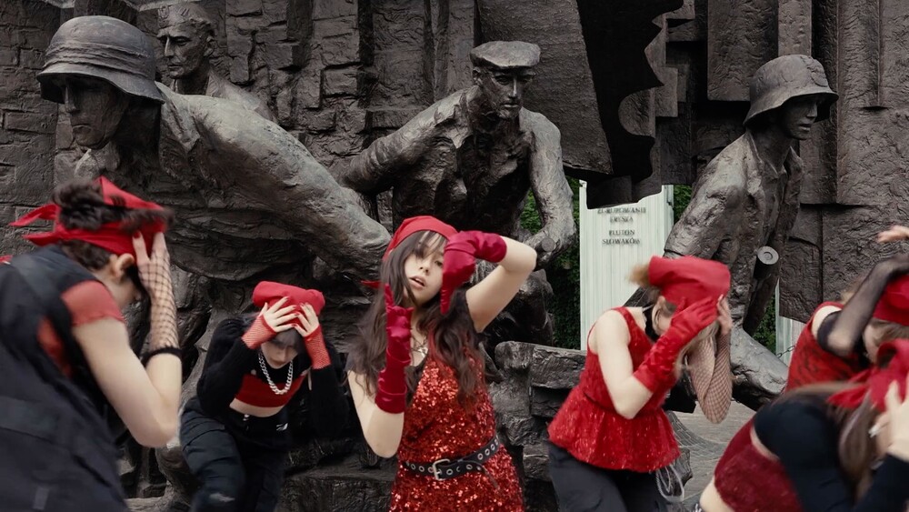
 They practiced their dance routines around old buildings, streets with powerlines on the floor, and monuments that can draw similarities to the war that the voice was telling Weronika about. The images of Weronika stabbing a strawberry with her nail, the red and gold balloons of the year 1898, and the burning of music sheets made it feel like the dance group was getting ready to fight and as if the dance was more towards violence. The last part of the film looked like a dance music video, Weronika was in the middle of the group and was the lead singer. I liked how this film focused on voices, images, and dance to represent war, unity, and reorganization.

IF REVOLUTION IS A SICKNESS- SCULPTURE CENTER

Prayers to the Stolen at MoMA

For this assignment, I went to the Museum of Modern Arts; and watched Prayers to the Stolen, directed by Tatiana Huezo. Prayers to the stolen is a film about the story of three little girls who become teenagers in a time where their small town in Mexico is at war. The film is compelling from the start as it takes place in a poor, small town where everyone knows each other. The film begins with images of  Ana one of the three little girls playing in the dirt with her mother. The film suddenly changes tone a couple of minutes into the film, as the mother asked, the little girl to get inside a hole they dug. The image of the little girl inside the hole lingered on the screen for longer than comfortable, foreshadowing what was to come.

Later on in the film Ana and her mother were doing their daily chores, all of a sudden, they hear a vehicle approaching their house in the distance. The mother cues Ana to hide. A group of men gets off the vehicle. Ana’s mother opens the door with a machete behind her back. The men ask for her daughter, to which she answers that she only has one son. The group of men furious go through her house confirming what she had told them. To their surprise, they couldn’t find anything against her. They left but before they did they fired a gun in her direction to send a message. Ana’s mother ran to the hole where Ana was hiding to her relief Ana was without harm as the men did not find her. They both laid inside the hole crying. This scene was beyond powerful as it pretty much comes full circle revealing to the viewer the reason for the earlier images in the film. It also shows the state of the town and how those people lived in constant fear. The main issue presented in this film is that the narcos would randomly come into those small towns and go house by house for their young daughters.

The lighting looked so minimal as if one was physically there in the location where the story took place. Also, the lighting looks so flawless and compliments the actor’s complexion nicely. In terms of music and sound, this film doesn’t have as much dialogue but in the scenes where silence is predominant, it also plays a big role in the overall meaning of the film. It captures the fear of the characters and also how the kidnaps have affected the community and how they dealt with their pain and grief for the stolen. The sound design was rich with various sound elements both used to add suspense and to capture the world of the story. The camera movements looked convention for a fictional film; however, in some instances, some of the shots seemed to be in a documentary style. For example, in a scene, one of the three girls were on their way to school when a helicopter was passing by it released some kind of poison in the air. The girl notices and runs faster to her school. When she gets there the other two girls from their friend group go after her into the restroom where they both quickly pour water all over her. In this scene, the camera follows them into an intimate space and shows them being vulnerable to the attacks but also being united in that process. The tracking shot of the characters into the restroom rather than cutting to it made the scene feel more like a documentary rather than fictional. It felt as if the viewer was living that horrendous experience with the characters

Prayers to the Stolen at MoMA

A Desynchronized Multimedia

This past weekend, I went to visit Joan Jonas’s exhibition of three collection works in Dia Beacon, NY. I learned that she was born in New York in 1936 and is Professor Emerita at Massachusetts Institute of Technology, Cambridge. The exhibition was placed in the lower level of the gallery. It was dark and the sounds of her video productions created a serious tone throughout the exhibition. In other words, it set the tone of her message which was mysterious and rustic. 

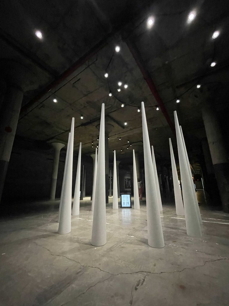
One of the first collections that was introduced was the Mirage, a series of tall white cones in a circle with a video monitor in between playing her video May Windows. The video monitor was an old television set that was laying on it’s side and it displayed a highly contrasted black and white shot of her moving in front of white windows. Adjacent to this art was the After Mirage (Cones/May Windows), which had metal cones with a duplicated set to the first one. The video playing on the old television set on its side. These pieces of artwork reminded me of royalty as they stand tall with a stage light aiming directly down. 

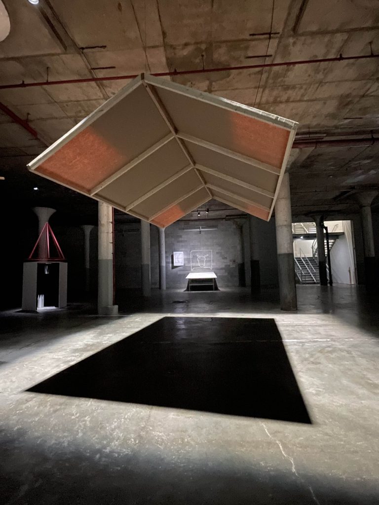
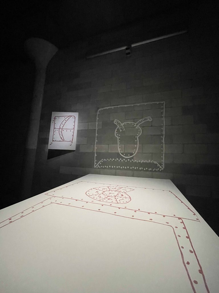
On the right side of the exhibition was Stage Sets. Jonas created this in 1976 where temporary walls that looked like canvases were suspended from the ceiling creating a silhouette on the ground with the stage lights. In front of it was a drawing that could be interpreted as an animal or heart. Below was a canvas that acted like a desk that had a drawing in red ink or marker. The drawing appeared to be a pathway with numbers and blocks separating them as it turned into a circle. In addition, there was a drawing with the similar style suspended on the wall in an angle creating a 3D look.

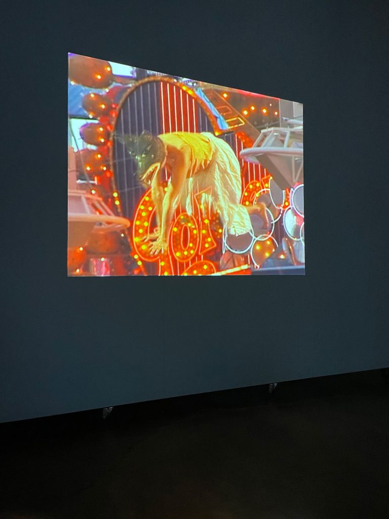
As one moved further into the collection, her work expanded to experimental footage that played in a continuous loop that complimented each other as they played everything at the same time. This became one of my favorites of Jonas, The Shape, the Scent, the Feel of Things. This project, (2004) is a video color projection that incorporated props that were also displayed in the museum. The first video is suspended, and she acts like a wolf by walking around with her hands and feet in her vicinity. She is also wearing a wolf mask that was referenced in the following video that was projected in a large screen. Although the first video was short, the second footage was a recording of a play. The speakers were on the pole of the museum and the seating were white benches. There was a man on the left front of the stage and a woman dressed in rags had a journey with a wolf. The wolf was taxidermies and was displayed in the props section. In total, there were five screens where the stories visuals of the videos were unrelated but the references were interconnected with one another. One of them was comical as two women with tutus were fighting each other with wooden swords. It was very childlike and the props for their survival brought a mature touch to the piece.

What made this work astonishing was that every prop, performance, actor, dog, and clothing were interconnected in good timing. In other words, when one was introduced to her footage, the storyline of the next one would oddly make sense. This exhibition wasn’t jarring and the western style brought the screenings, art work, and paintings together as it is a refection of her style.

Gallery

Jason Livingston at Hunter College: Ancient Sun

By Michael Osorio

At Hunter College, we had the pleasure of talking and interacting with Jason Livingston, an artist who creates videos and digital media art surrounding subjects related to animals and other current situations. While Livingston is currently pursuing a PhD at the University at Buffalo, Livingston’s work has been recognized throughout various galleries and shows and he has won awards for his work. Livingston seems to be very invested in the environment and how the land connects with the previous indigenous people from New York and the surrounding states, his parents were also involved with some companies and some projects that Livingston seemingly draw inspiration from. Livingston also has worked with prisons, especially this one prison from Auburn that has manufactured the majority of the license plates. It appears to me that Livingston actively searches out locations that have some sort of roots to nature or connection to the bigger world but is hidden to the average person. For example, Livingston briefly talked about how streaming, such as streaming a movie from Netflix uses up a lot of electricity. Livingston is heavily invested in the well-being of the world, whether it is about the health of earth or the health of society. Livingston also gave us the pleasure of showing us one of his latest projects called Ancient Sun.

Ancient Sunshine focuses on the location of Vernal and Carbon County which are located in Utah. The piece is somewhat narrative as we are shown what these locations look like while listening to people talk about their experiences in these respective locations. The video opens up with goats, and we even see a dead goat while the people talking hear amused. Then in Vernal, there are people who talk about a shop that charge extra if you’re liberal, and they held a sign “honk if you love babies” to raise awareness of the effect negative of the pollution on infancy and they were competing with someone who had a sign that said, “honk if you love drilling”. Then in Carbon County, a man was talking about the history of mining in the county and how they unionized and aren’t completely Utah in a sense. The audience sees goats being handled by children and a woman talking about how the oil rigs are meant to reduce dependency on foreign oil which is apparently a lie because those oil rigs are used to control trade. We then see several odd images in black and white most likely relating to Utah and its oil rigs and suddenly the announcement of the passing of Muhammad Ali overtakes the topic. We can hear Muhammad Ali talk about racism while we see images of Carbon County oil and mining. A lady then proceeds to talk about a rainbow event and how it taught her many things in regards to camping, and then we see a giant sun descend on an inverted black and white land. A lot of the video moving forward is invented black and white until we see some sort of smithy and some odd animal-shaped objects. The video ends with a text that shows resistance isn’t slowing down despite their struggles. It’s clear that the video is very political and disagrees with the actions taken by the companies and corporations sacrificing the health of many for money and control over stuff like trade. It’s a rather intense video that’s meant to cause the viewer discomfort. It’s almost like the video is supposed to be a call to action or a rally for the supporters of the resistance.

Jason Livingston at Hunter College: Ancient Sun

If Revolution is a Sickness

The exhibit I visited was Diane Severin Nguyen’s video work If Revolution is a Sickness showing at the Sculpture Center in Long Island City. If Revolution is a Sickness is moving image work set in Warsaw, Poland that loosely follows the character of an orphaned Vietnamese girl, Weronica, who grows up to be a part of a K-POP inspired performance group. The first element of notice in this exhibit appears as soon as you make your way into the area, as the staging of the video is a work of art in its own merit. Edged by two PA speakers and pleated yellow fabric, red carpet covers the floor of the main center of the Sculpture Center where the stage is mounted. This red and yellow interior design of the space matches the color scheme of the film. 

When the main character Weronica first appears on screen, she is just a little girl, alone and literally washed ashore in Poland, imbued with the film color palate, donning a yellow shirt and red sleeves. From reading the exhibition guide, I have learned that the colors are significant to the Cold War, but they also possess an undeniable aesthetic charm. The fusing of the exhibition setting with the moving image work itself by way of color matching gives the work an immersive quality that sucks you into the scene. Because I was the only one present at the time, I went to see this exhibition, I felt as if the spectacle was put on for me and that immersed me more into the work. The scenes featuring Weronica as a young girl are complicated by the cryptic voiceover that consists of various and contradictory musings on the idea of revolution from figures such as Mao Zendong. The voiceover made me curios as to what Weronica’s form of revolution would look like when she reaches an older age and could make sense of her circumstances and position in Poland. 

We then flash forward to Weronica as an isolated ang gloomy teenager, privy to her thoughts through internal monologue spoken in Vietnamese with English subtitles. Through her internal monologue, we know she is wrestling with her status as an outside in Poland. She questions “do they really think I’m cute or just different?” However, Weronica does not let her self-doubt consume her, as she assumes that spectacle and performance will grant her the greatest agency. She says, ““If I don’t become an artist then I will just remain a victim. I must appear to myself as I wish to appear to others.”

From there, we get to the final segment of the work and my personal favorite, the pure spectacle. Gone is the revolutionary rhetoric and in its place is a bubblegum KPop music and a music video to go with it. A crew of Polish dancers donning matching yellow and red outfits performed over a deliciously catchy bubblegum maximalist autotune hyperpop song. The catchiness and lightness of the song is undercut by the setting of the performance which takes place in front of various dreary Polish war monuments.  This disruption of spectacle comments on a specific generation shaping of a shared cultural national space, and the possibility of self-actualization within the realm of spectacle and performance. 

I thoroughly enjoyed If Revolution is a Sickness because it is the type of moving image work that eschews narrative, yet wat is explored is knowable and palpable. The imagery, specifically how sound, image, and text all work conjointly and against each other to create such a stimulating, stirring, and visually stunning work that I am eager to see again.
If Revolution is a Sickness